
Material Types
Every material has a type that matches a kind of real-world surface. This page describes the settings of each type. To pick one, see Choosing a Material Type. The settings that all types share, such as the normal map and emission, are on the Materials page.
Coated Material
Section titled “Coated Material”A matte base under a glossy layer. Use it for glazed ceramics, varnished wood and lacquered surfaces.
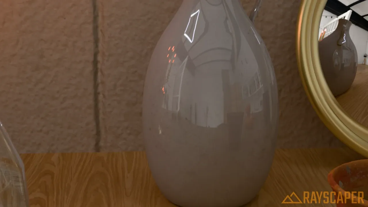
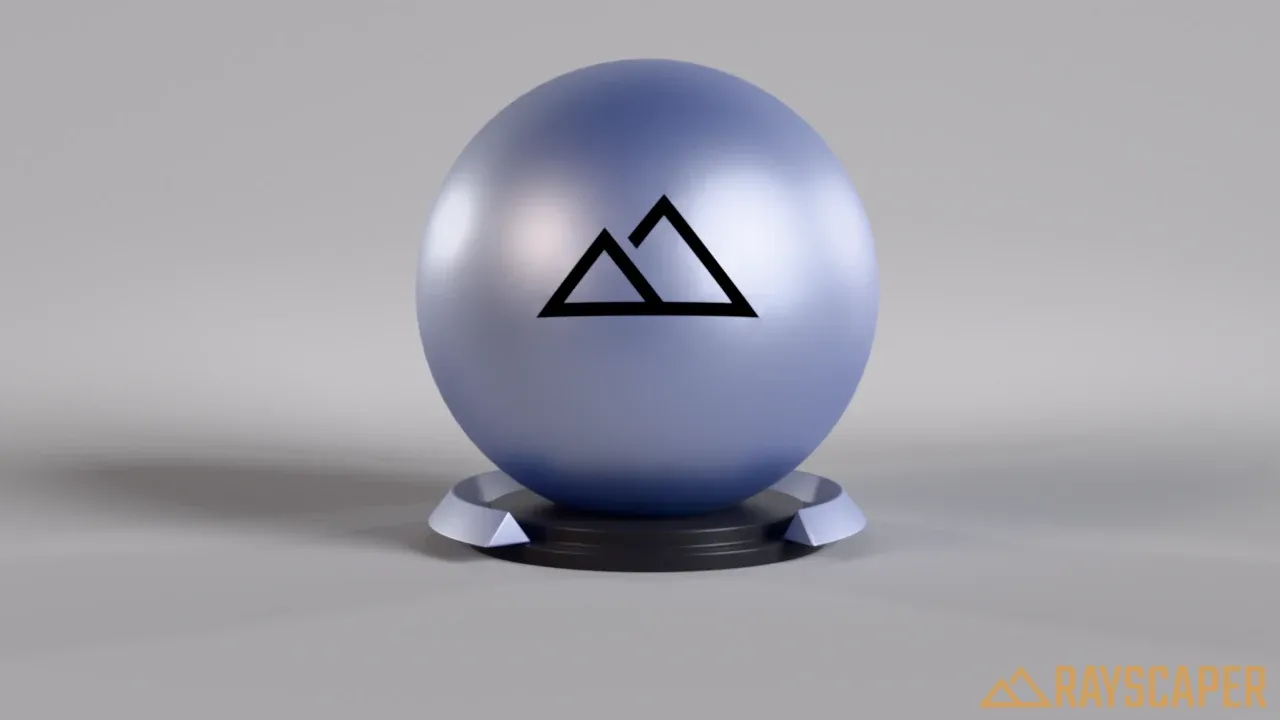
A glazed ceramic jug: a white base with a subtle, dark grey coating.
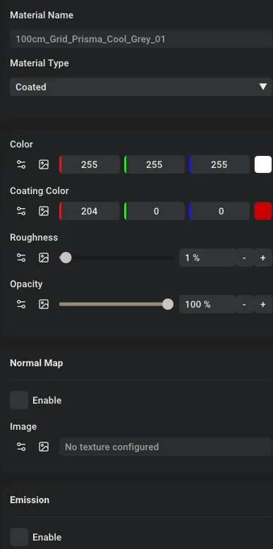
The Coated material settings: Color, Coating Color, Roughness and Opacity.
The Coated material mixes the base and the reflection half and half, at every angle. Coating Color sets the color and strength of the reflection: white gives strong, mirror-like reflections, and a dark grey (around 20%) a subtle, realistic glaze.
- Color: the color of the base, a single color or an image texture.
- Coating Color: the color and strength of the reflection.
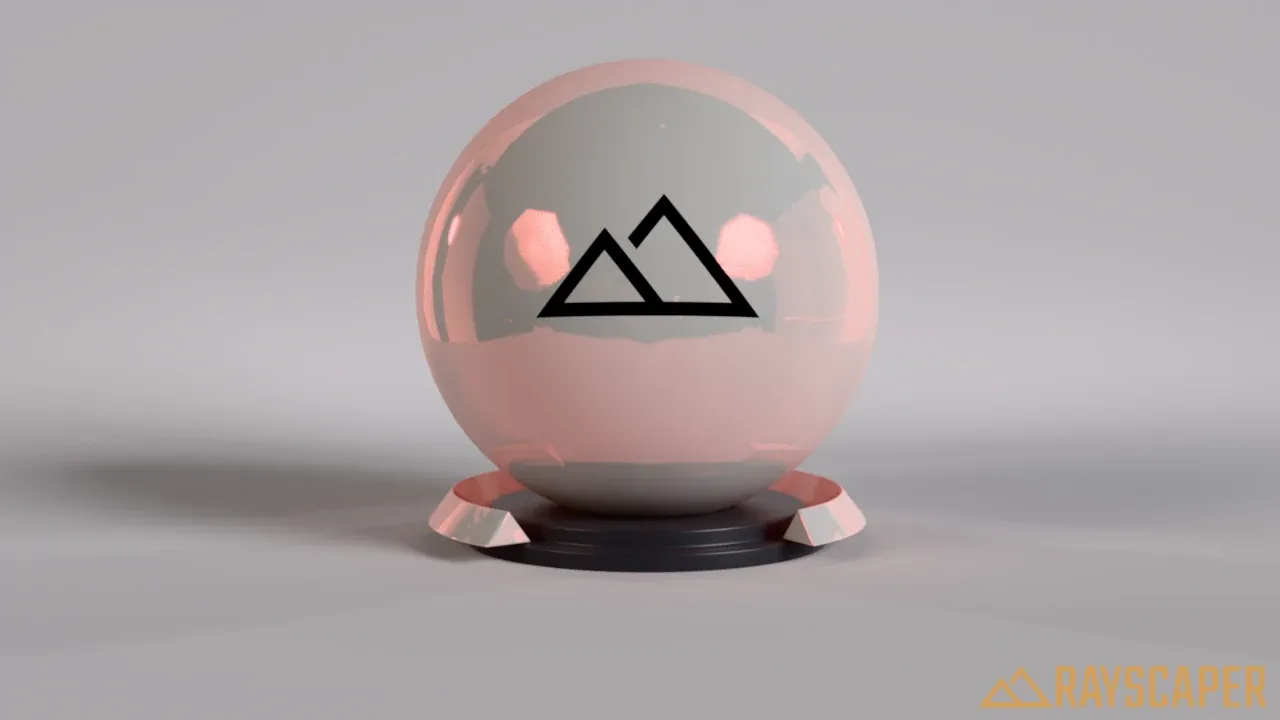
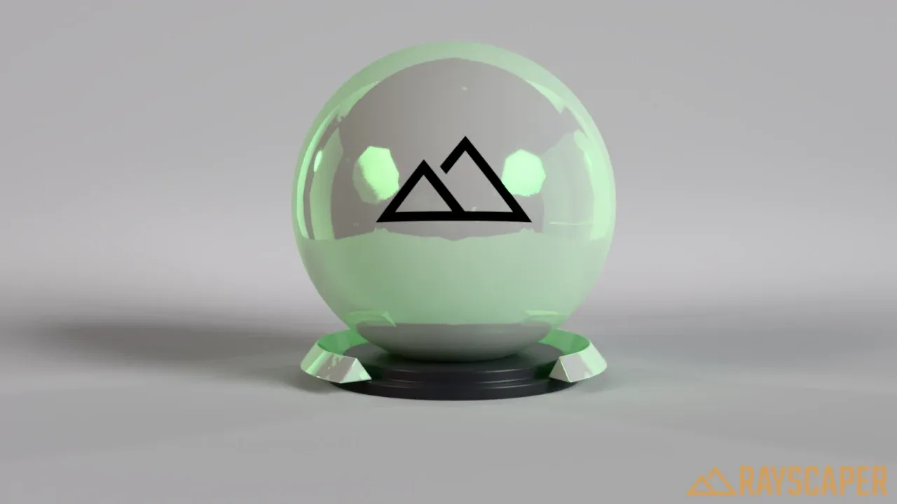
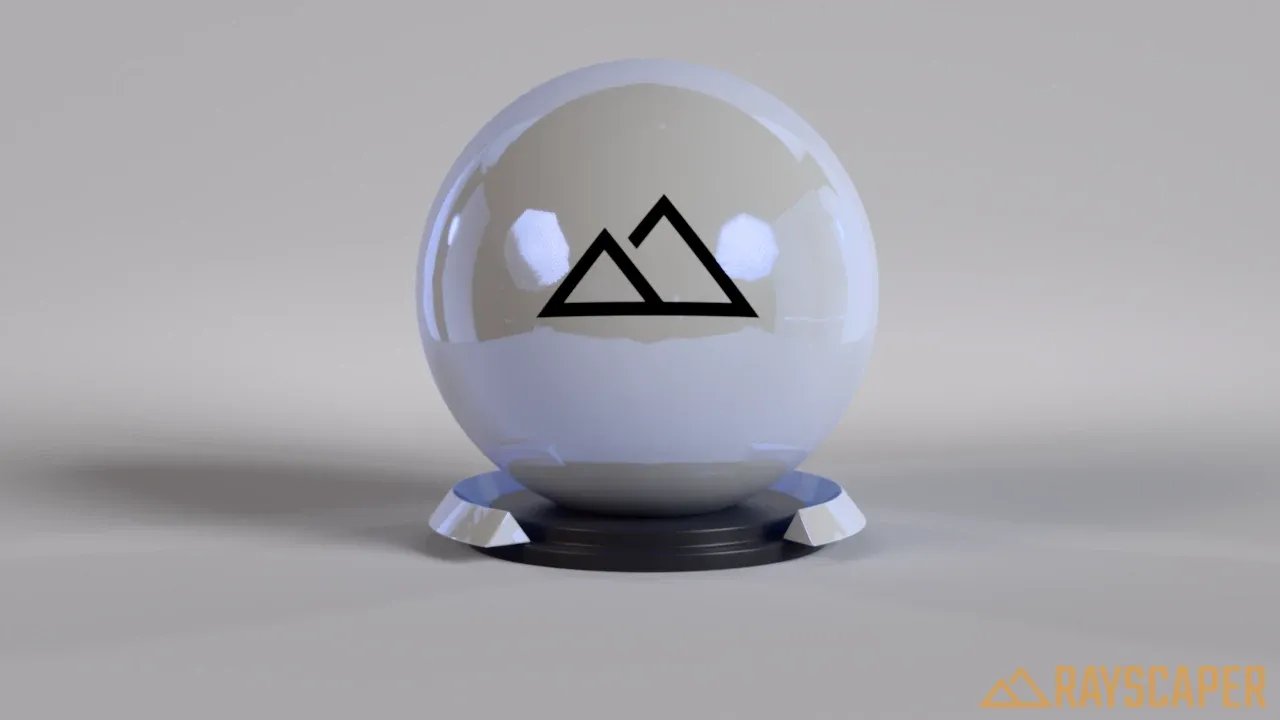
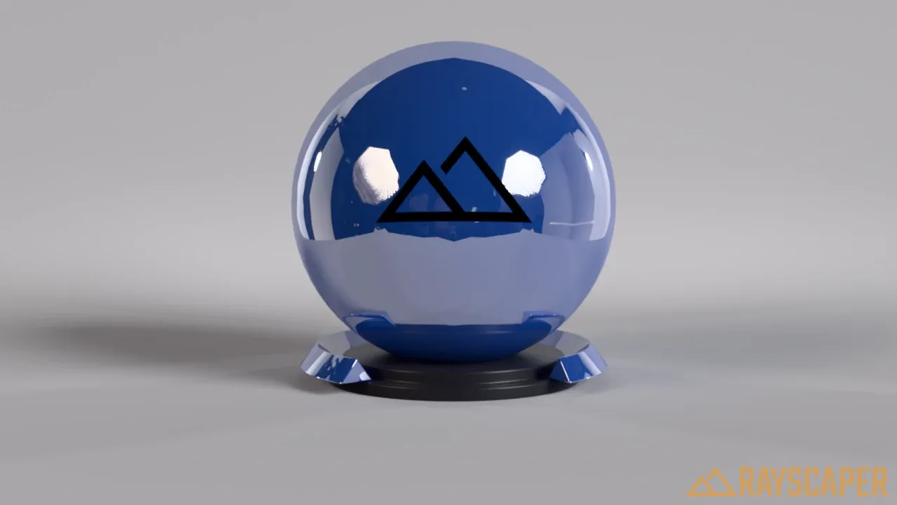
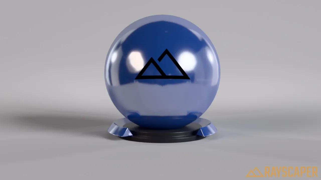
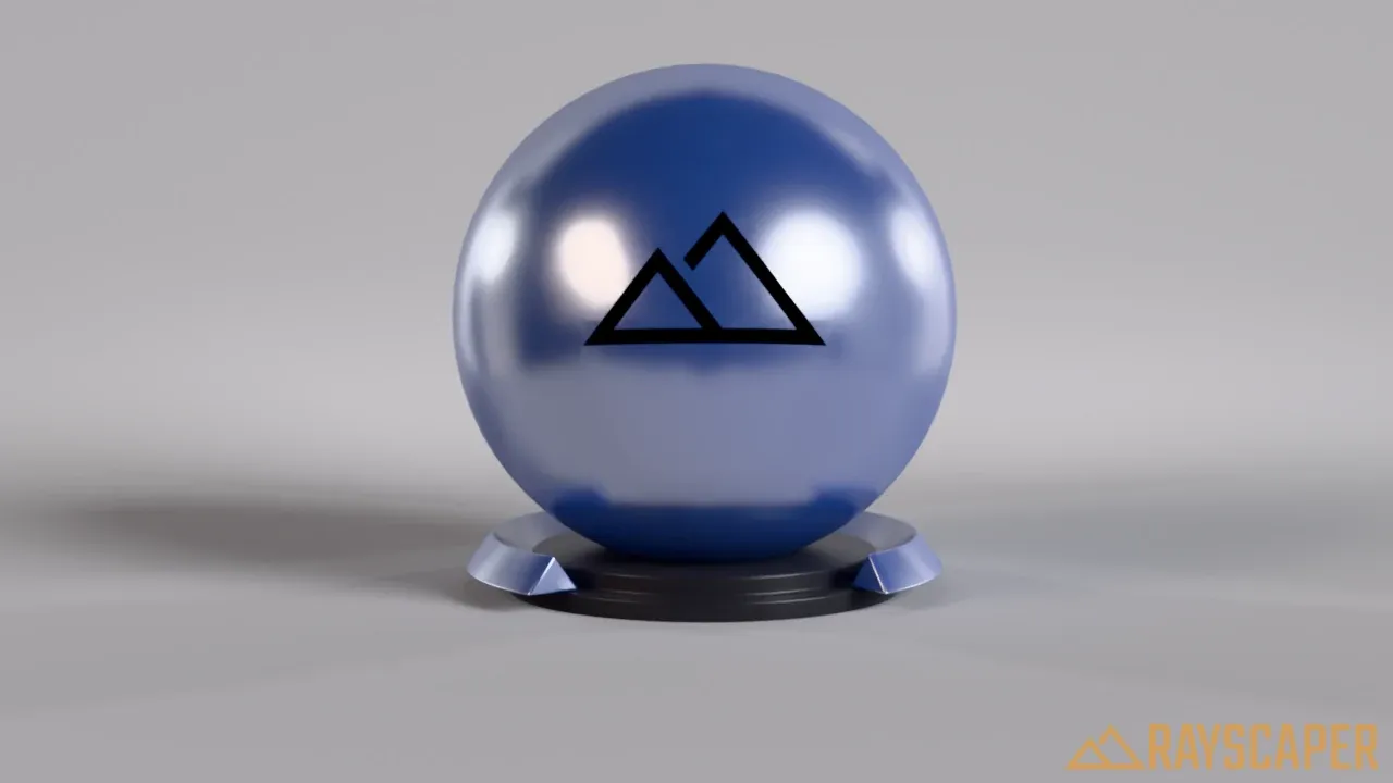
- Roughness: how sharp the reflections are. 0% gives mirror-sharp reflections, higher values blur them.
Diffuse Material
Section titled “Diffuse Material”A completely matte surface that scatters light evenly in all directions, without any reflections. It has no settings beyond the common ones.
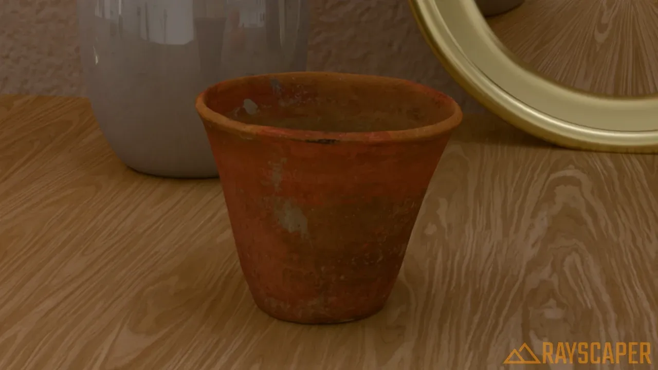
An unglazed terracotta pot.
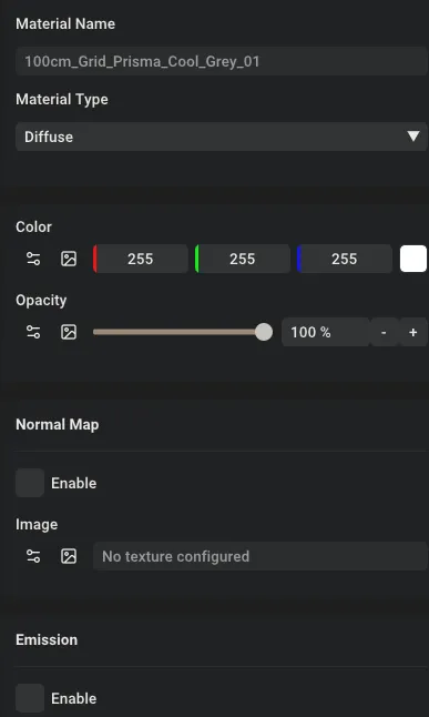
The Diffuse material settings: Color and Opacity.
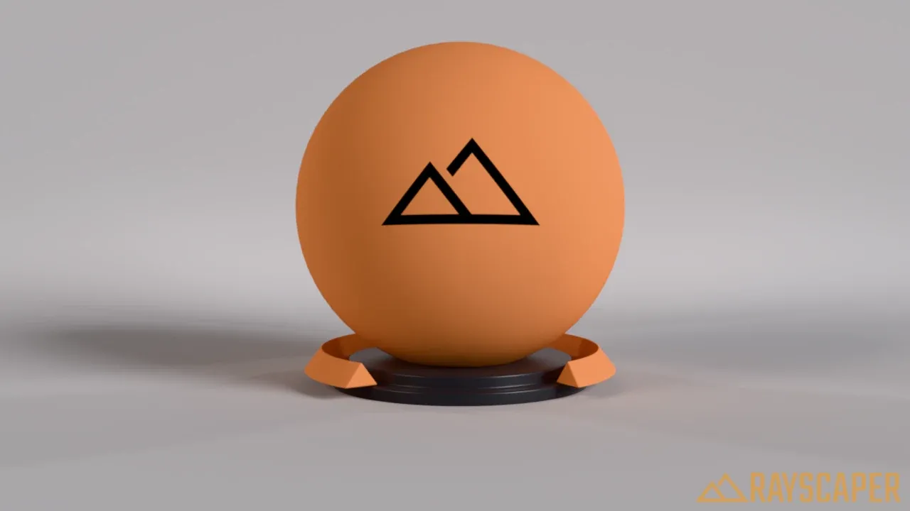
A diffuse material: just color, no shine.
Glass Material
Section titled “Glass Material”For windows, drinking glasses, bottles, gemstones, and water in a container. Glass reflects and refracts light like the real thing.
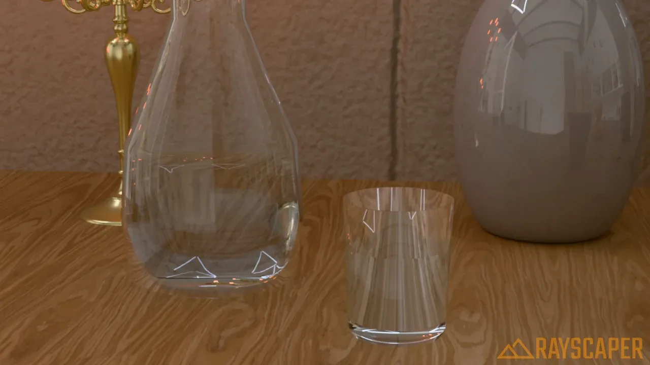
A carafe and a tumbler: glass with an IOR of 1.5, the water inside glass with an IOR of 1.33.
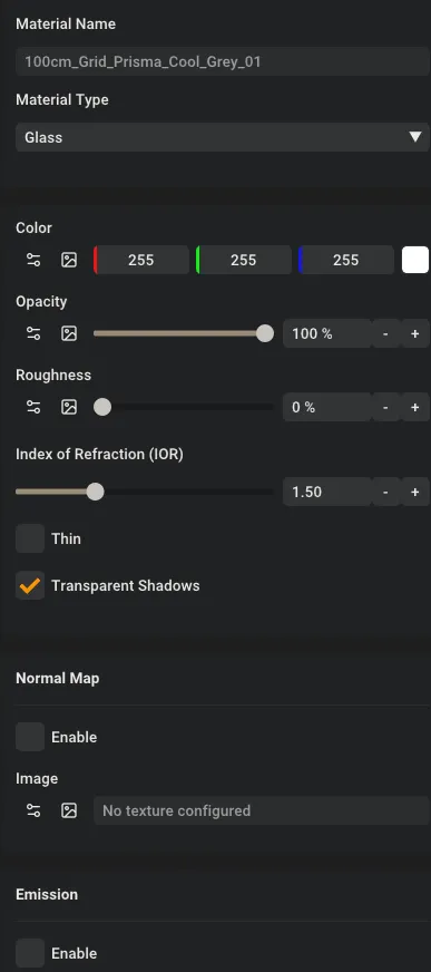
The Glass material settings.
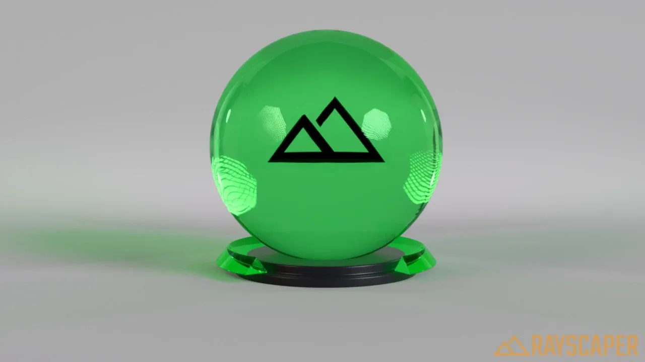
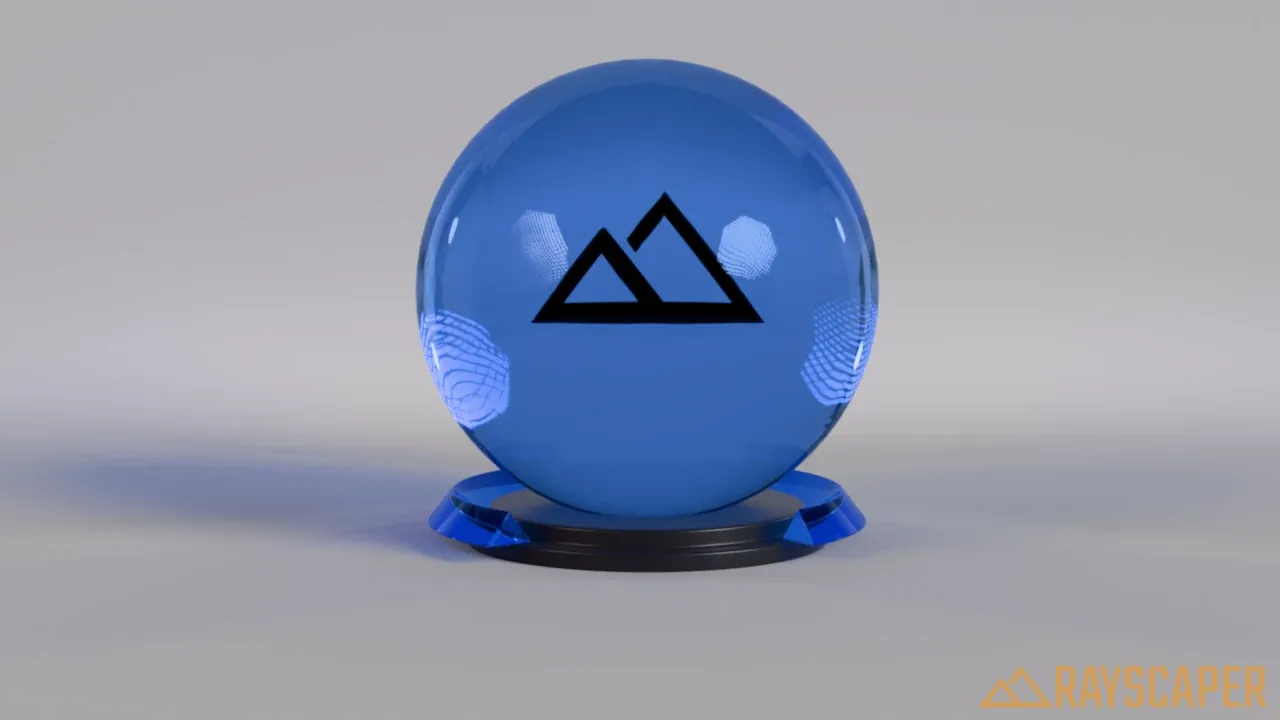
Color: the tint of the glass. Keep it white for clear glass. A color tints both the light passing through and the reflections.
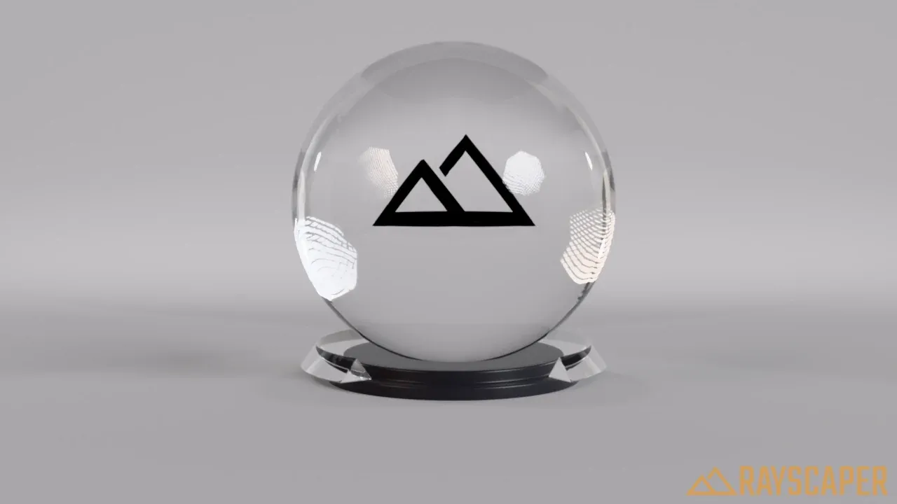
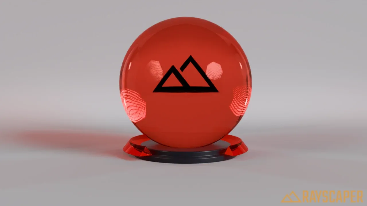
Roughness: frosts the glass. Use 0% for clear glass and higher values for frosted, etched or privacy glass.
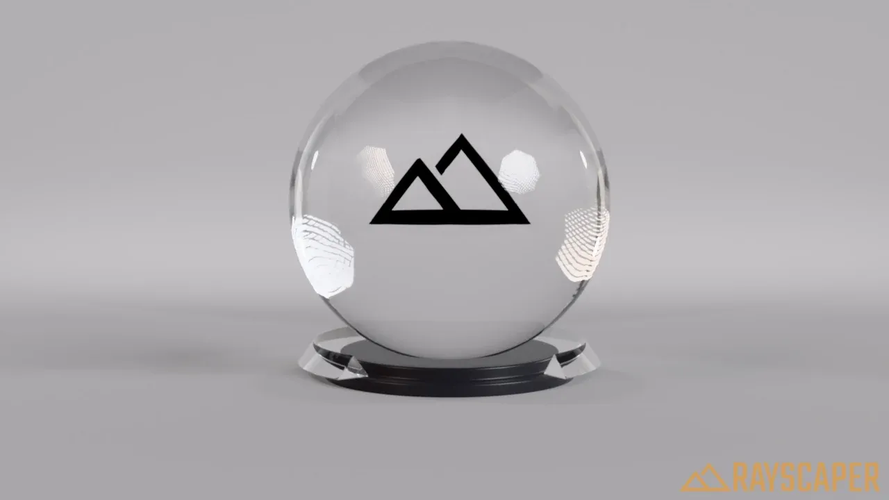
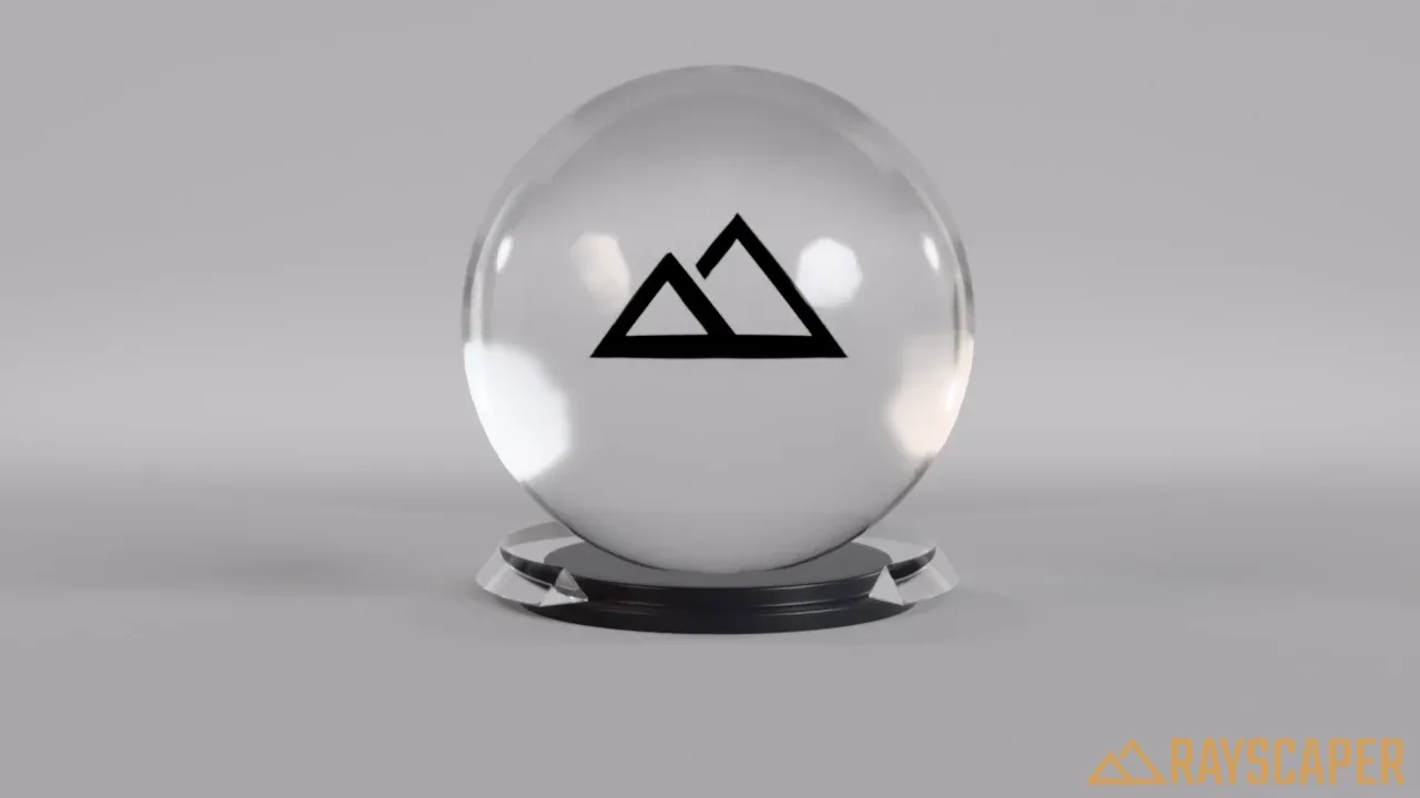
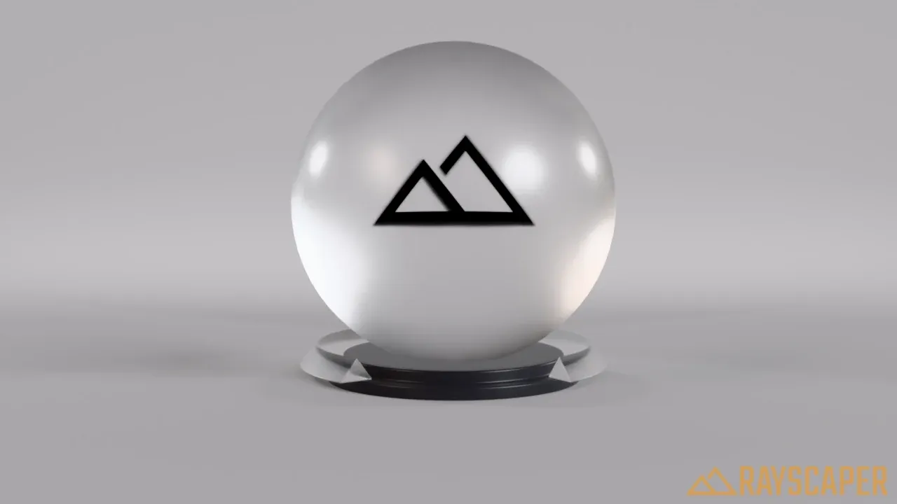
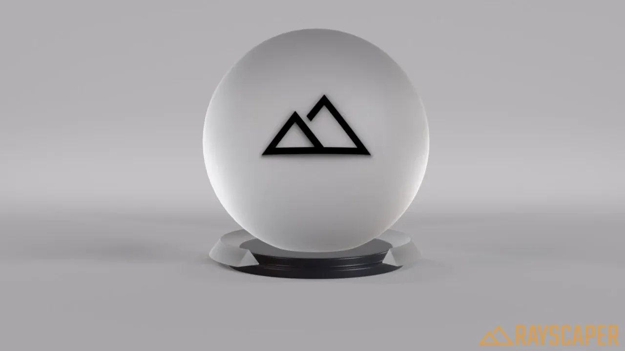
Index of Refraction (IOR): how strongly the glass bends light, and so how much it distorts what’s behind it. Higher values bend more and reflect more.
| Material | IOR |
|---|---|
| Air | 1.0 |
| Ice | 1.31 |
| Water | 1.33 |
| Glass | 1.5–1.7 |
| Ruby | 1.77 |
| Sapphire | 1.77 |
| Crystal | 2.0 |
| Diamond | 2.42 |
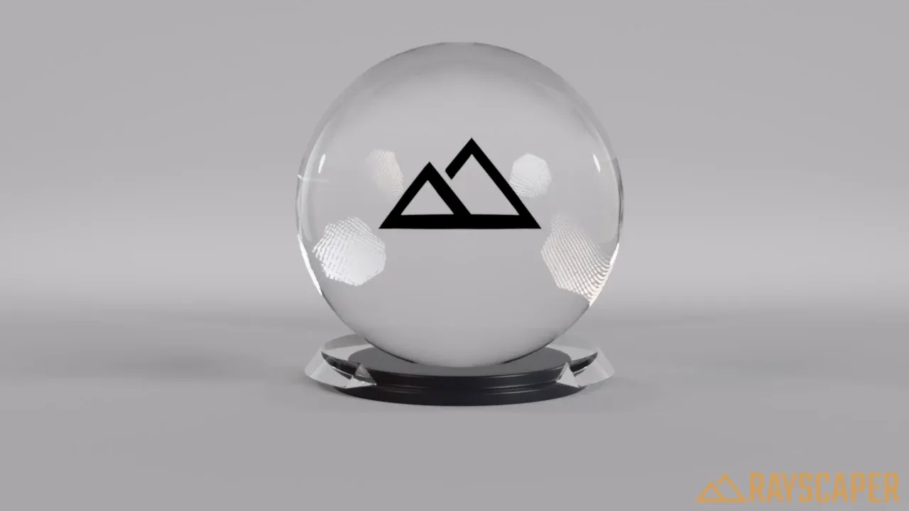
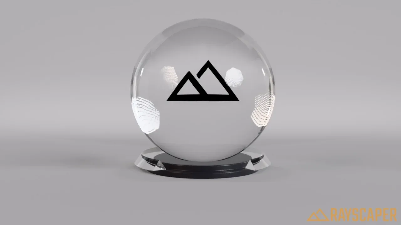
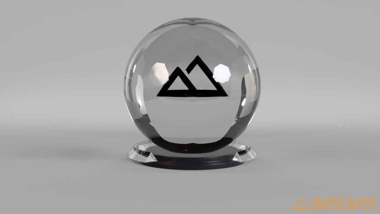
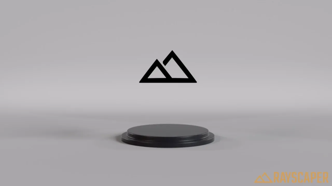
Thin: treats the glass as a sheet without thickness. Use it for window panes in buildings, which are modeled as a single face: it renders faster and looks right. Keep it off for objects with real thickness, like bottles, glasses and aquariums. Thin glass ignores Roughness. Off by default.
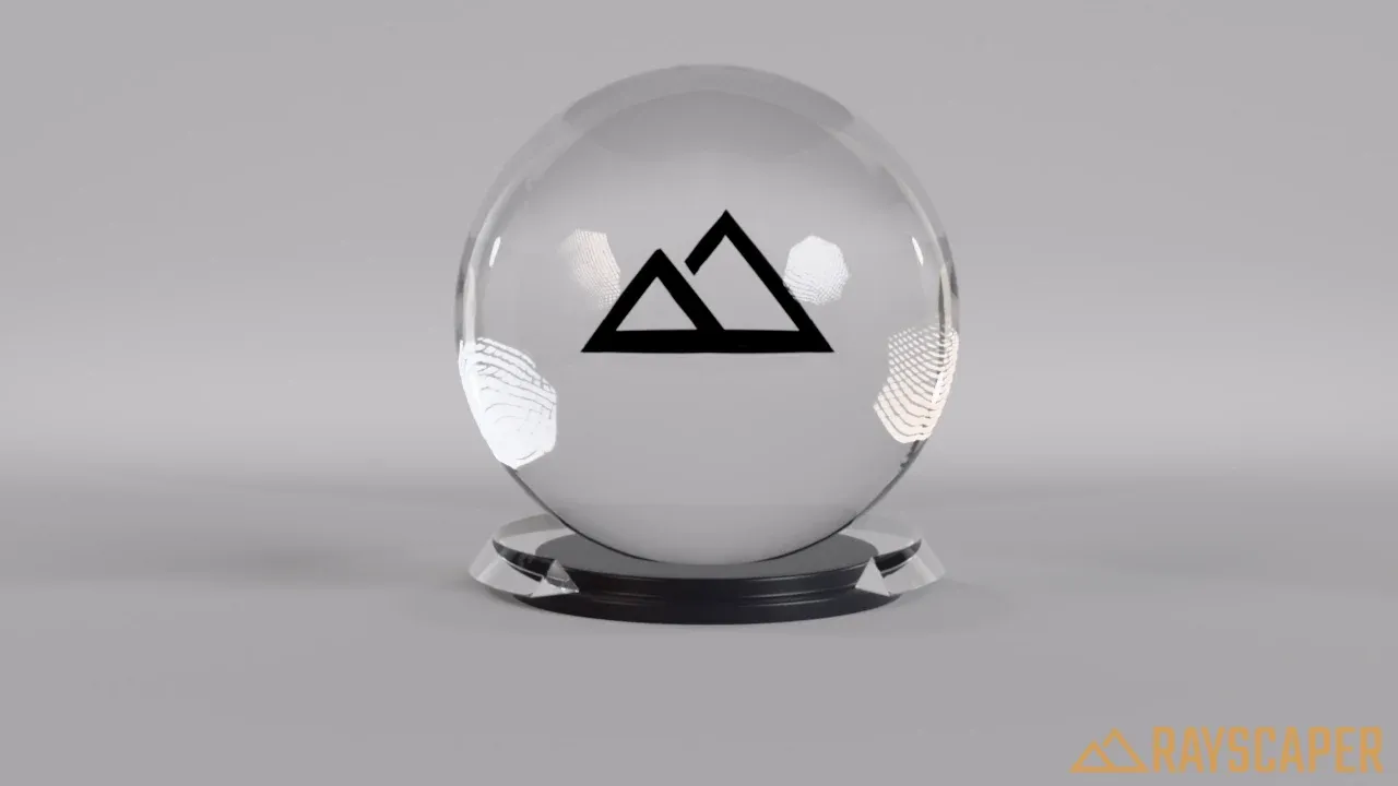
A solid ball of glass that bends the light.
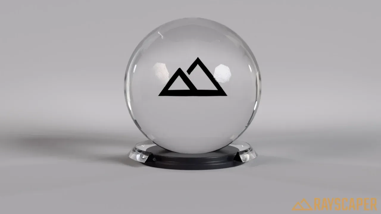
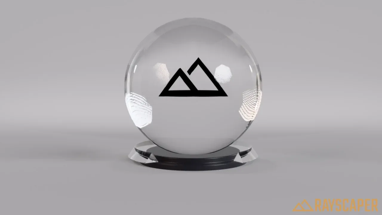
The ball is a thin glass bubble: only its reflections remain.
Transparent Shadows: lets light pass through the glass, so it casts a light shadow instead of a dark one. Keep it on for windows, otherwise the rooms behind them stay too dark. On by default.
Metal Material
Section titled “Metal Material”Physically accurate metals. Every metal reflects light differently, which Rayscaper describes with the metallic IOR and the absorption coefficient. The presets set both for you.
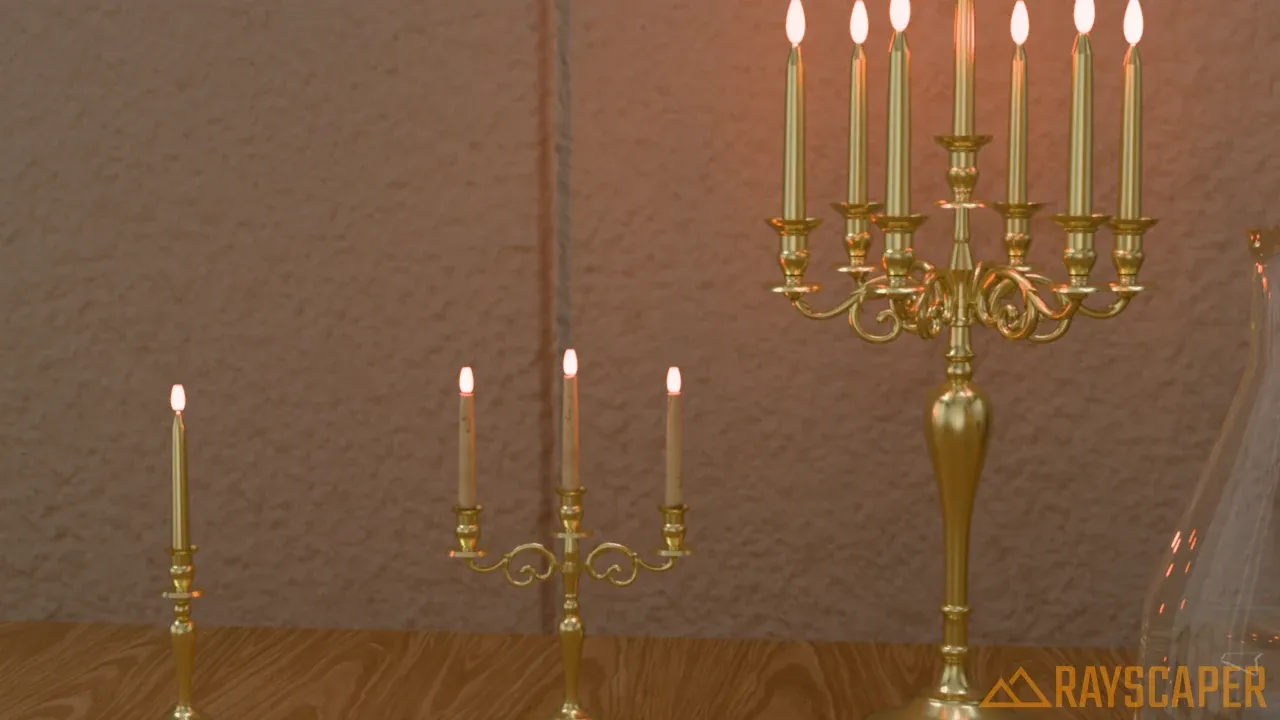
Brass candleholders with lit candles. The candle flames use emission.
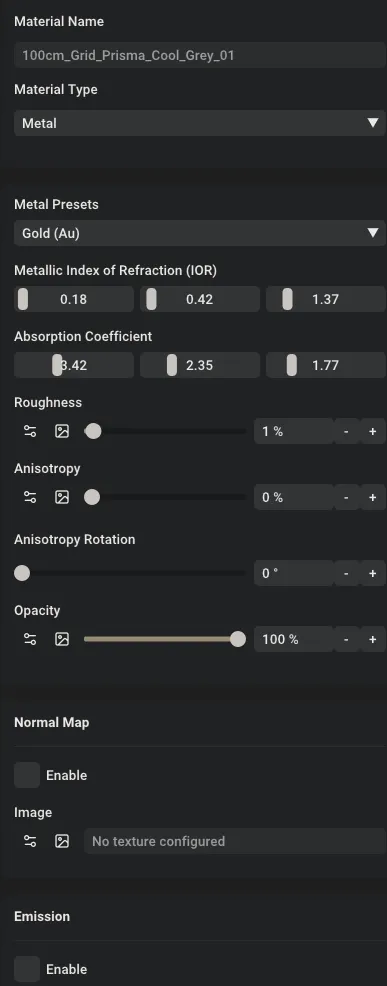
The Metal material settings.
| Setting | Description |
|---|---|
| Metal Presets | Common metals with measured values. Choosing one sets the Metallic IOR and Absorption Coefficient. |
| Metallic IOR | The index of refraction of the metal, per color channel (RGB). |
| Absorption Coefficient | How strongly the metal absorbs each color channel. Together with the IOR, it gives the metal its color. |
| Roughness | 0% is mirror-polished, higher values give satin, brushed and weathered metal. |
| Anisotropy | Stretches the highlights in one direction, for brushed metal. |
| Anisotropy Rotation | The direction of the stretching, from 0 to 360°. |
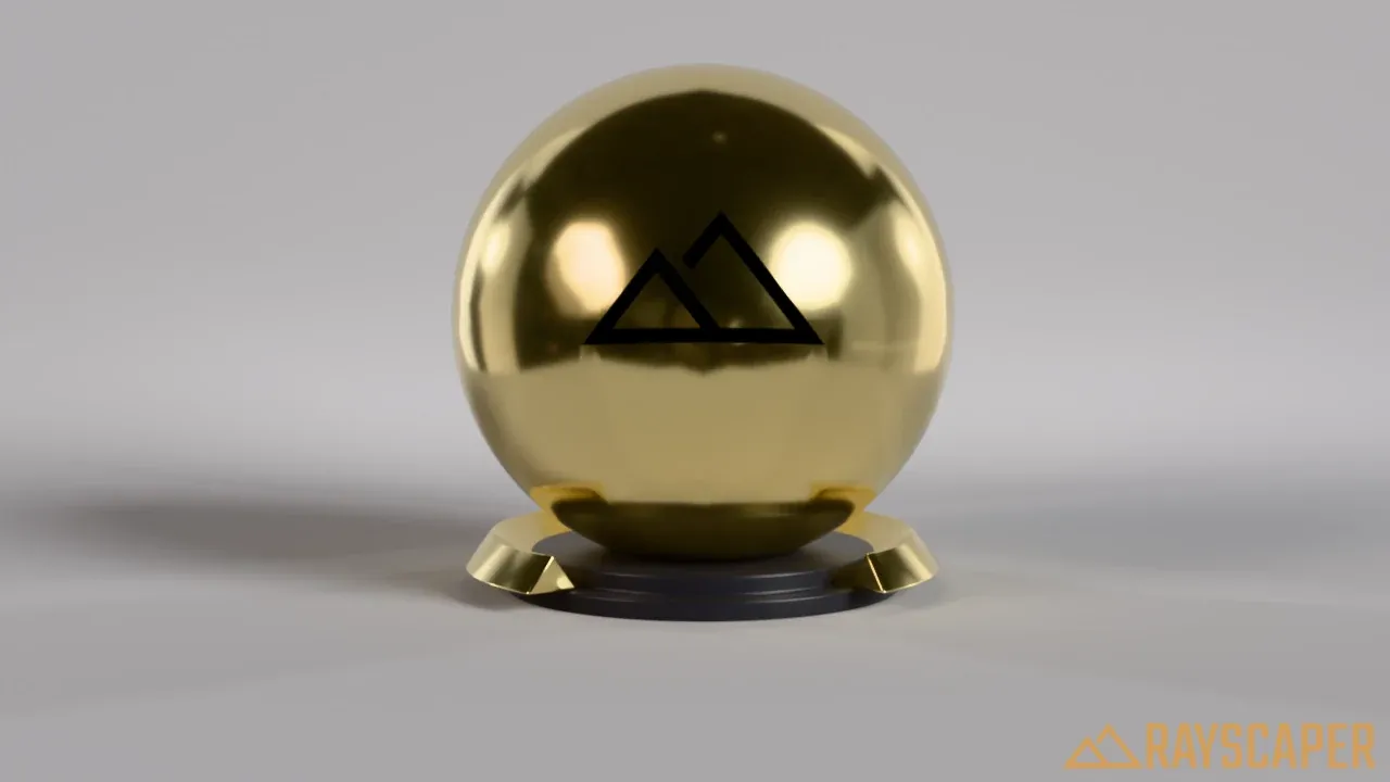
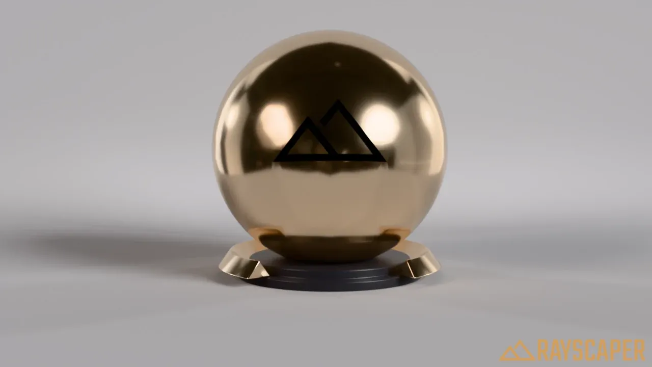
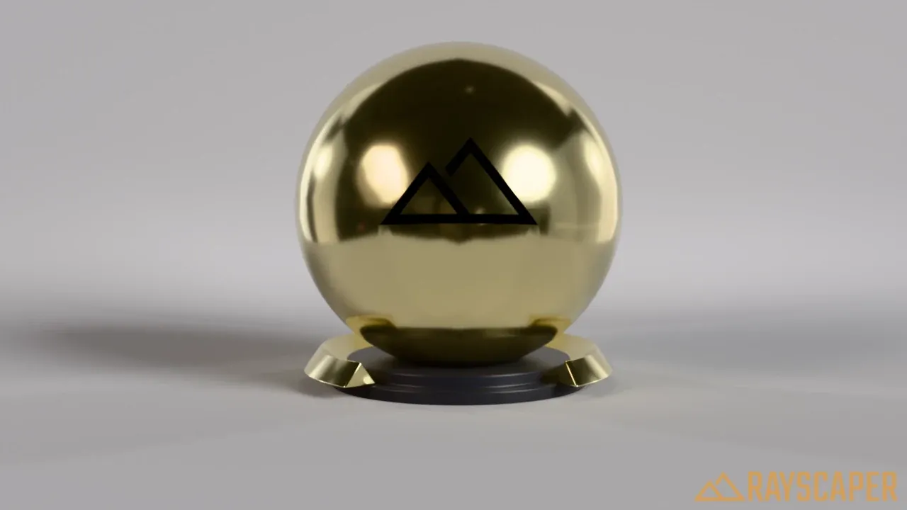
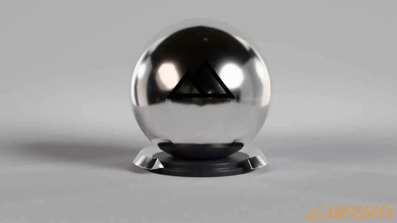
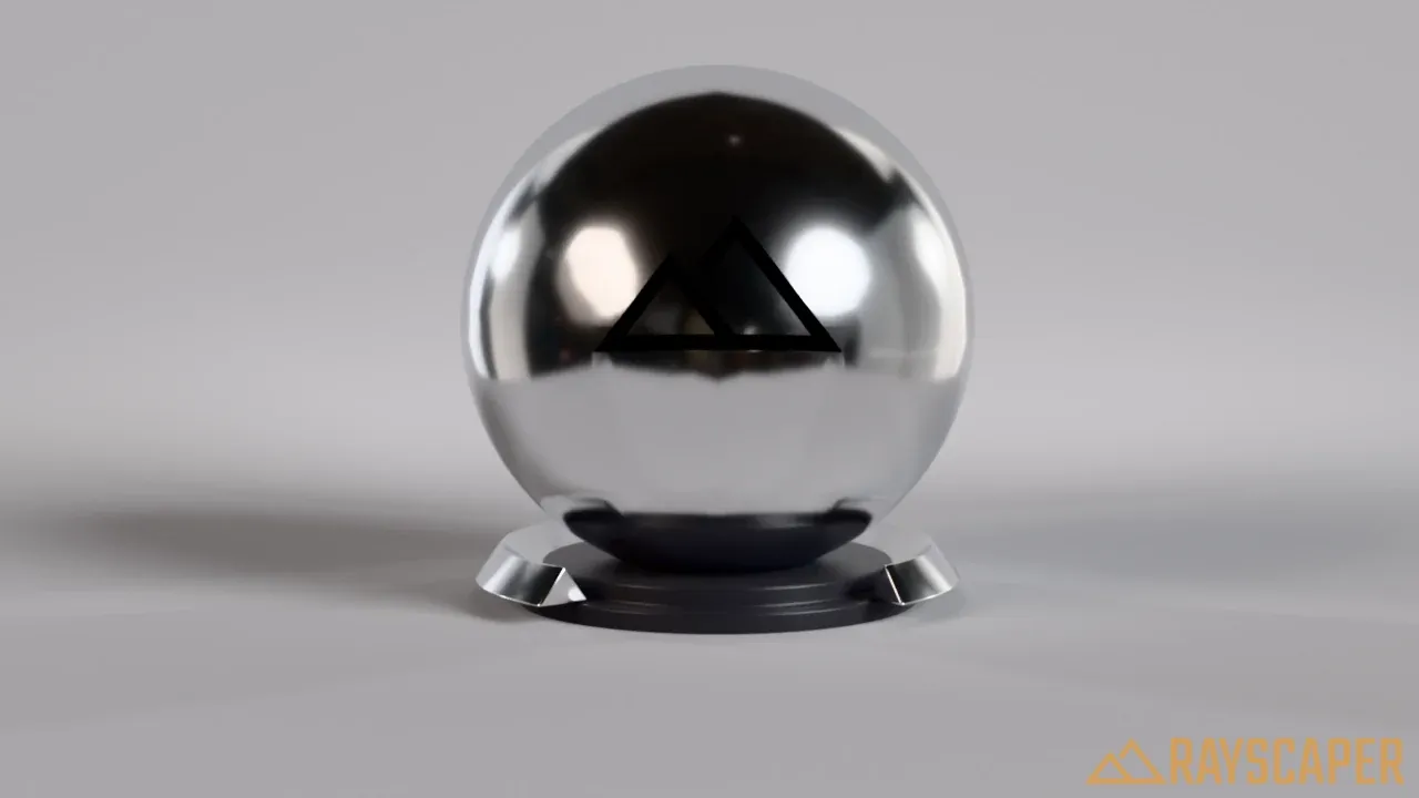
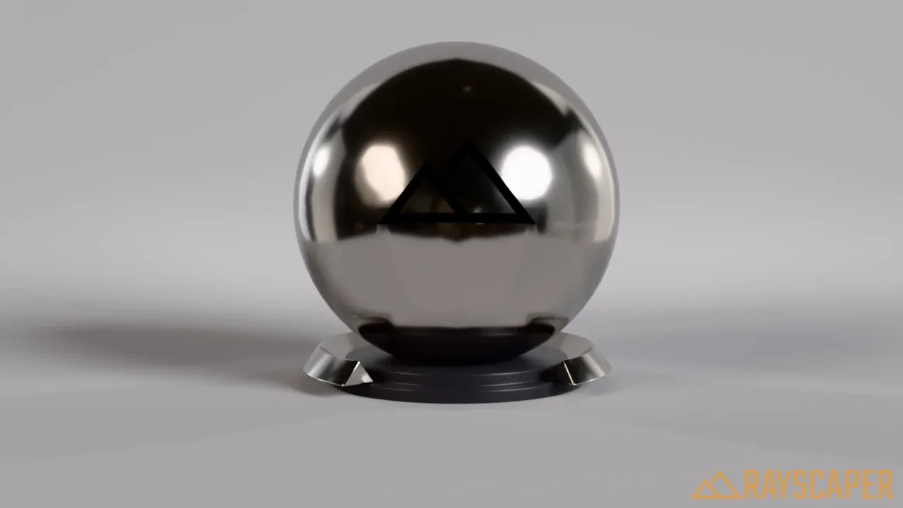
Six of the 20 presets, all with a roughness of 15%. Gold is the default.
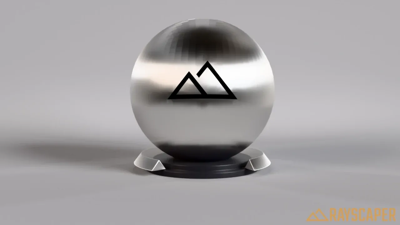
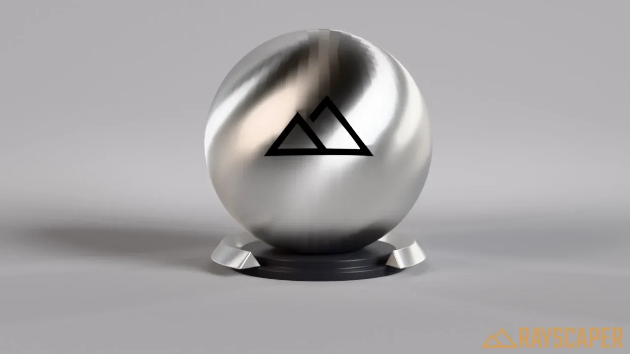
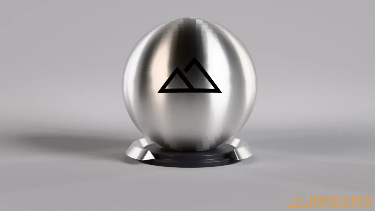
Anisotropy stretches the highlights along the surface, like the fine grooves of brushed metal do. It needs some roughness to show:
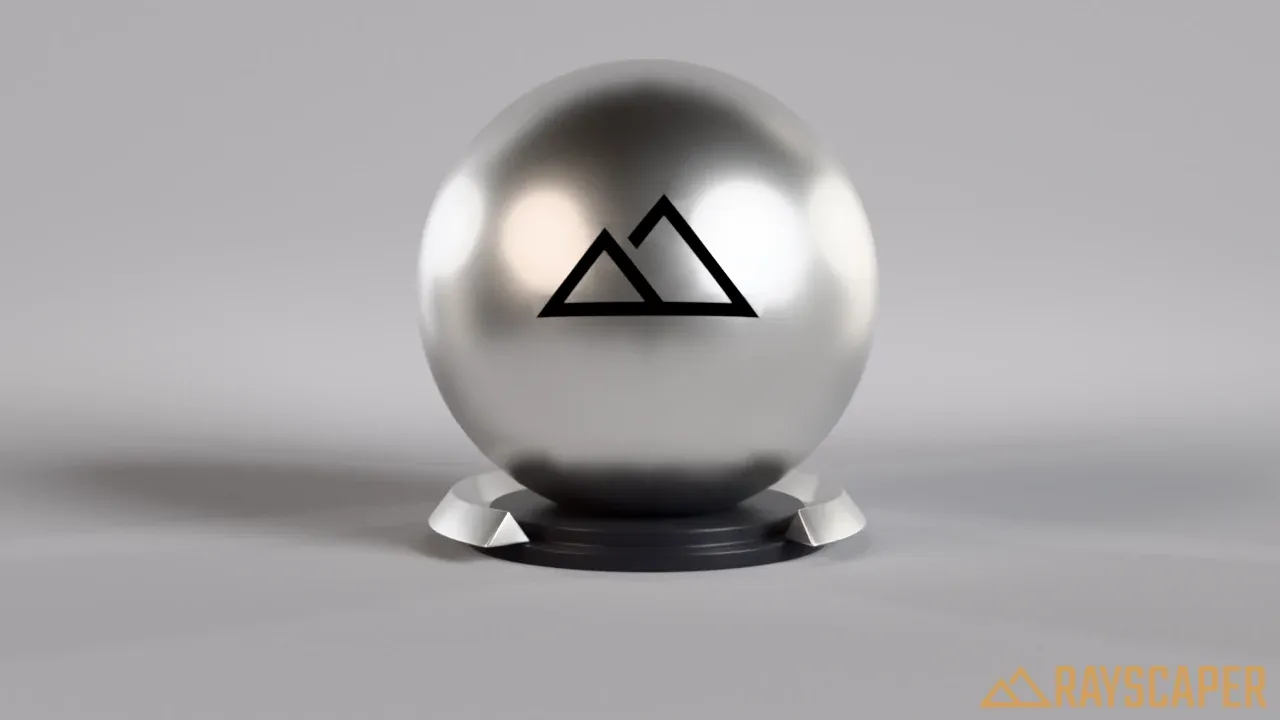
Round, even highlights.
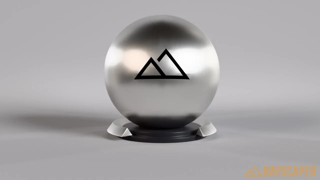
The highlights start to stretch.
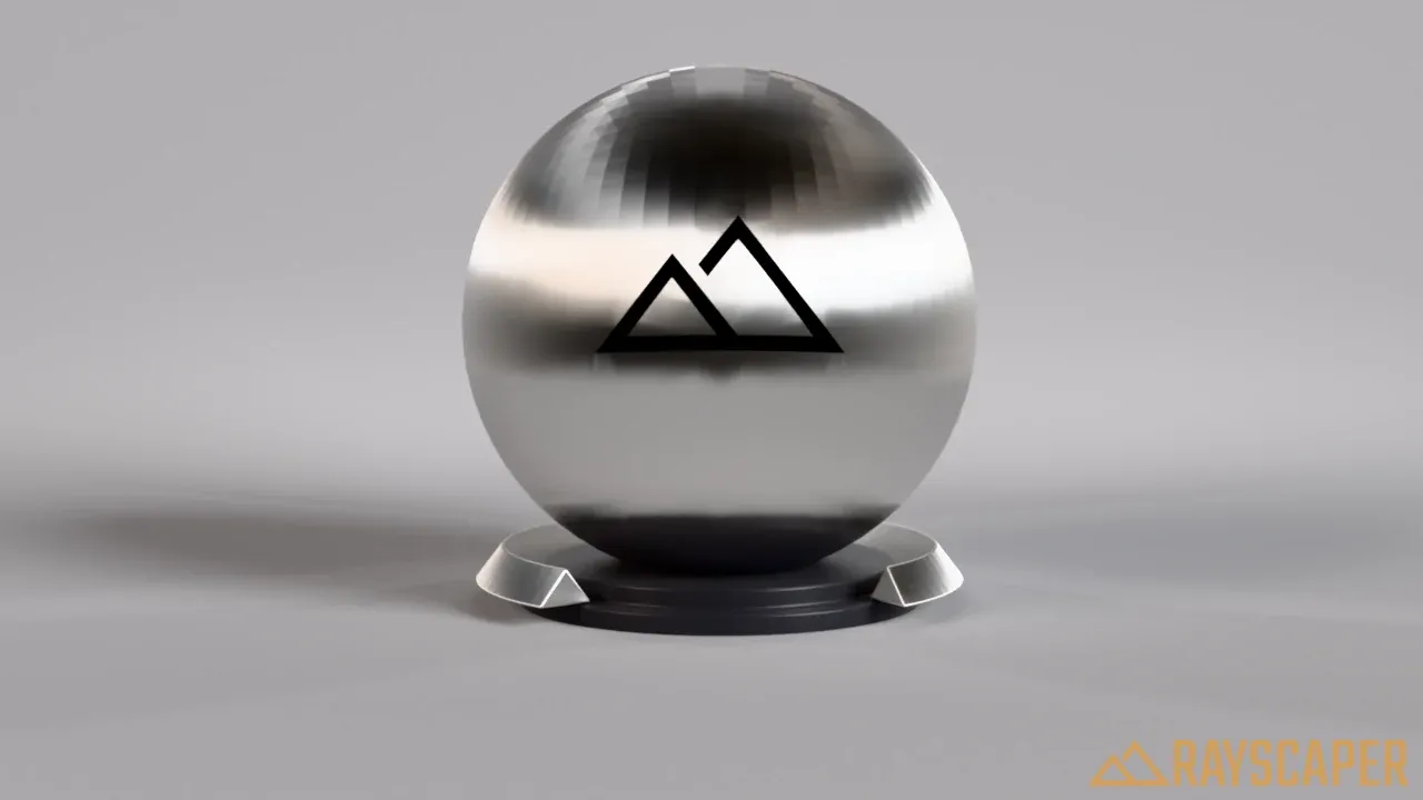
Long streaks, like brushed steel.
Anisotropy Rotation turns the direction of the streaks:
Reference values for common metals:
| Metal | Metallic IOR | Absorption Coefficient |
|---|---|---|
| Aluminium (Al) | (1.35, 0.97, 0.62) | (7.47, 6.40, 5.30) |
| Brass (Cu-Zn) | (0.44, 0.53, 1.09) | (3.70, 2.77, 1.83) |
| Copper (Cu) | (0.27, 0.68, 1.32) | (3.61, 2.62, 2.29) |
| Gold (Au) | (0.18, 0.42, 1.37) | (3.42, 2.35, 1.77) |
| Iron (Fe) | (2.91, 2.95, 2.58) | (3.09, 2.93, 2.77) |
| Nickel (Ni) | (1.99, 1.92, 1.73) | (4.21, 3.62, 2.94) |
| Platinum (Pt) | (2.38, 2.08, 1.85) | (4.27, 3.72, 3.14) |
| Silver (Ag) | (0.16, 0.15, 0.14) | (3.93, 3.19, 2.38) |
| Titanium (Ti) | (2.74, 2.54, 2.27) | (3.81, 3.43, 3.04) |
Mirror Material
Section titled “Mirror Material”A perfect mirror. The Color tints the reflection.
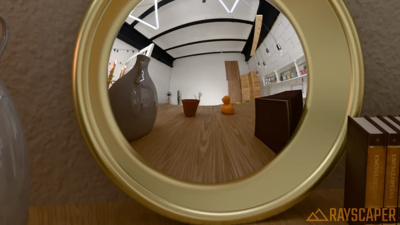
A round mirror leaning against the wall.
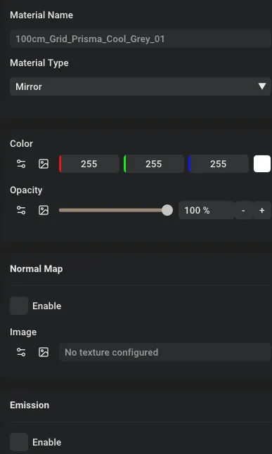
The Mirror material settings: Color and Opacity.
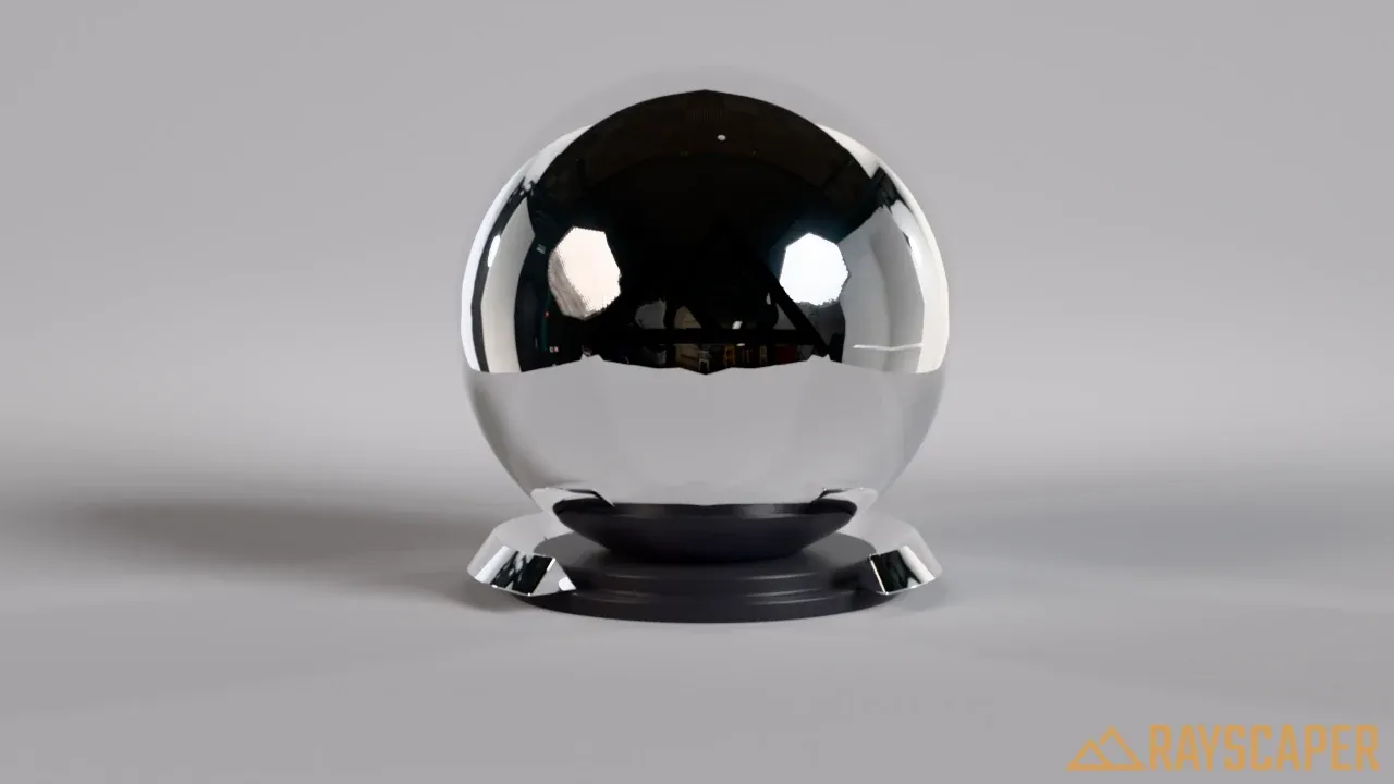
A mirror ball reflecting the studio and its softboxes.
PBR Material
Section titled “PBR Material”Rayscaper’s most versatile material, which can represent almost any real-world surface. It’s based on Physically Based Rendering, and is often called the “principled” or “Disney” material in other software. Use it with scanned and downloaded PBR textures, like the ones from the asset manager.
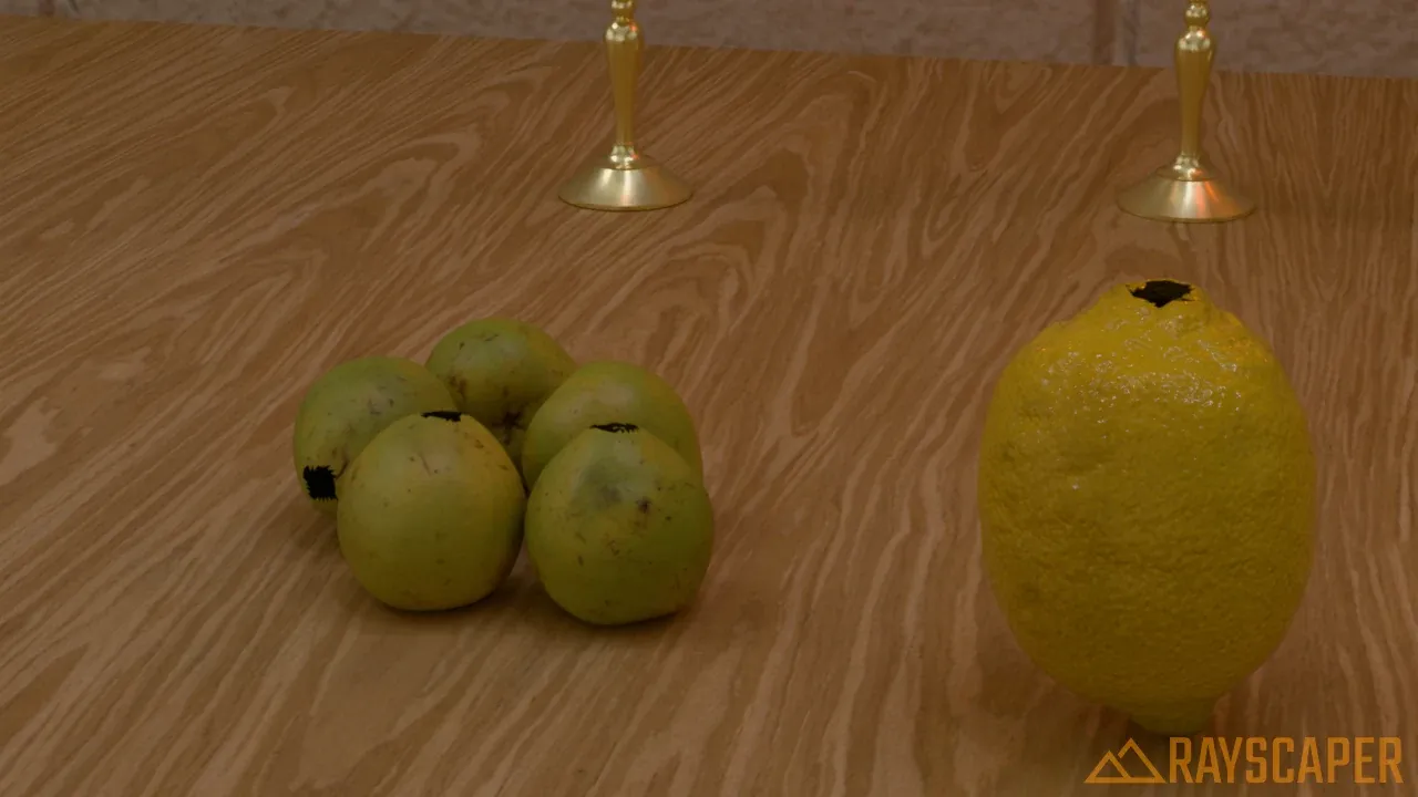
Scanned fruit and wood: PBR materials with color, roughness and normal maps.
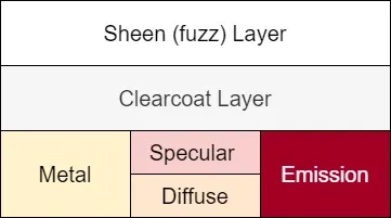
The layers of the PBR material.
The PBR material stacks layers. At the base, Metallic blends between a non-metal, like plastic or wood, and a metal. A specular reflection sits on top of the base. Coating adds an optional clear varnish on top, and Sheen a soft glow at the edges, like velvet. Transmission lets light through, for glass-like materials.
Main Settings
Section titled “Main Settings”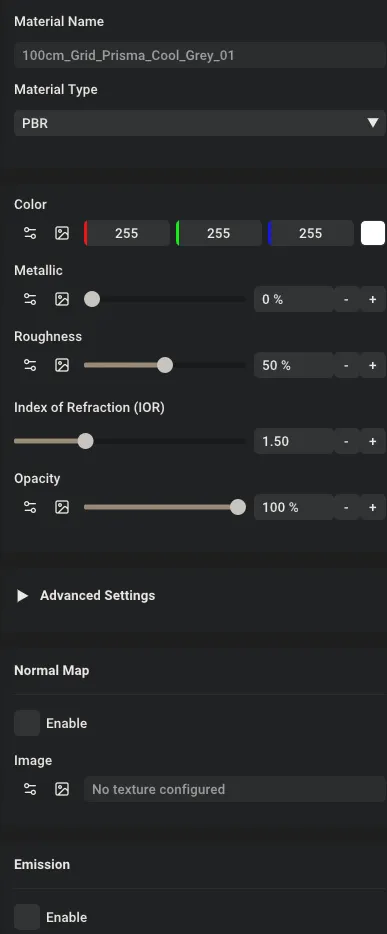
The PBR material main settings.
Color: the base color, ideally an image texture with the natural color of the surface.
Metallic: blends between a non-metal (0%) and a metal (100%). Real surfaces are one or the other, so use values in between only for transitions in a texture, like paint worn down to the metal.
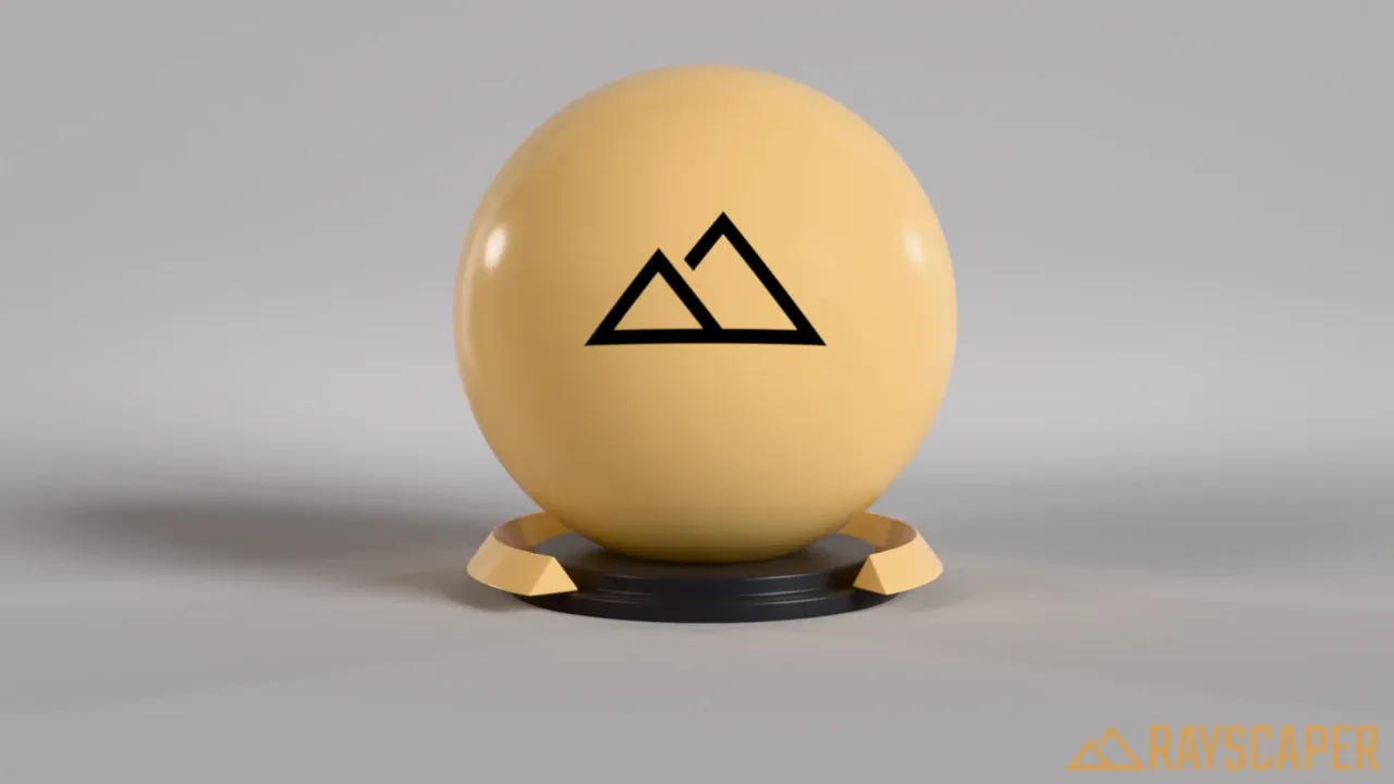
A non-metal: the color is in the surface, the reflections are white.
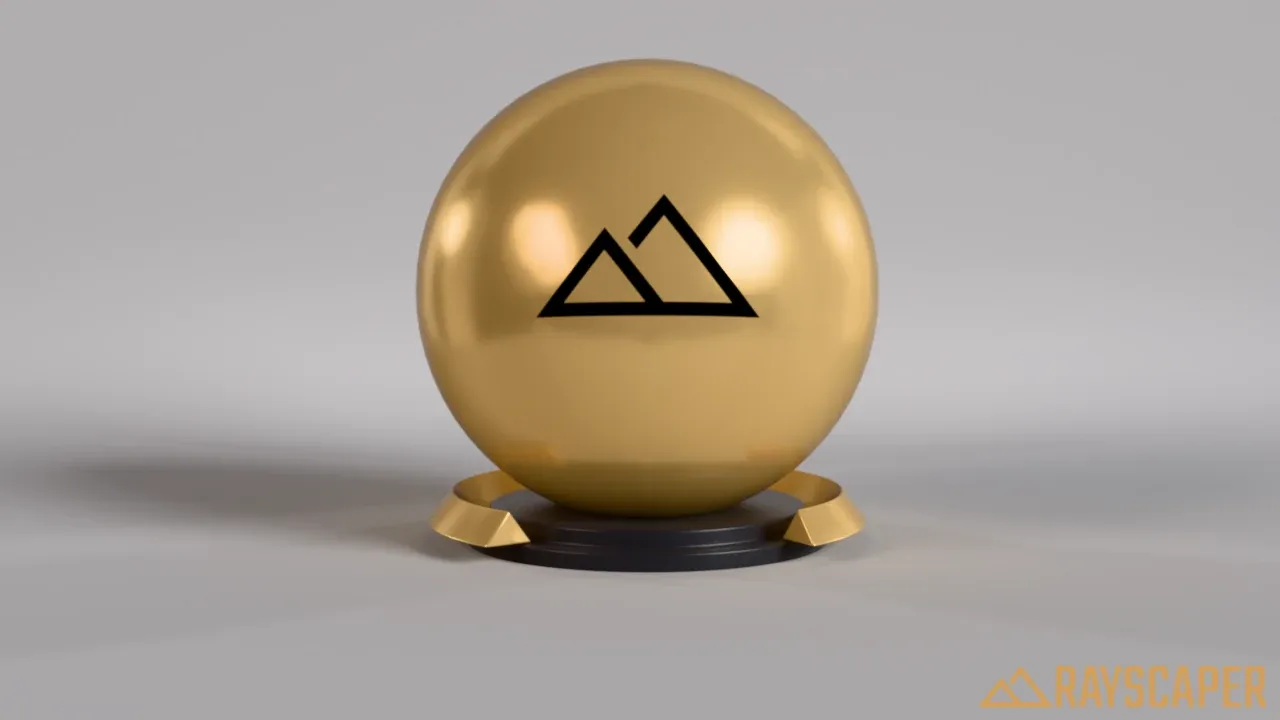
Halfway.
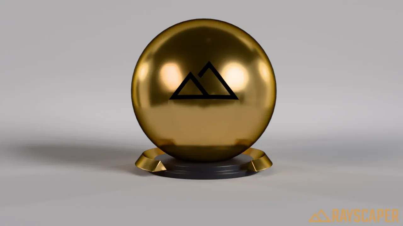
A metal: the color is in the reflections, like gold.
Roughness: how smooth the surface is. 0% gives mirror-sharp reflections, 100% a completely matte surface. Use a roughness map for realistic variation across the surface.
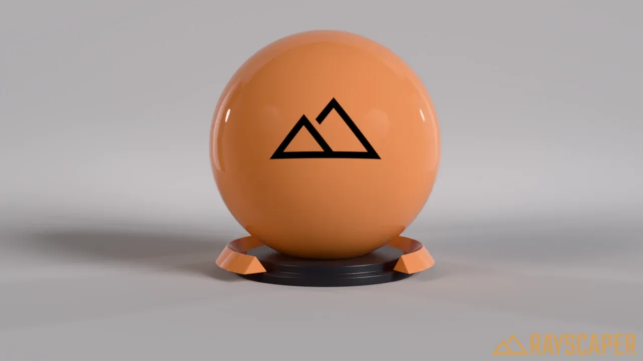
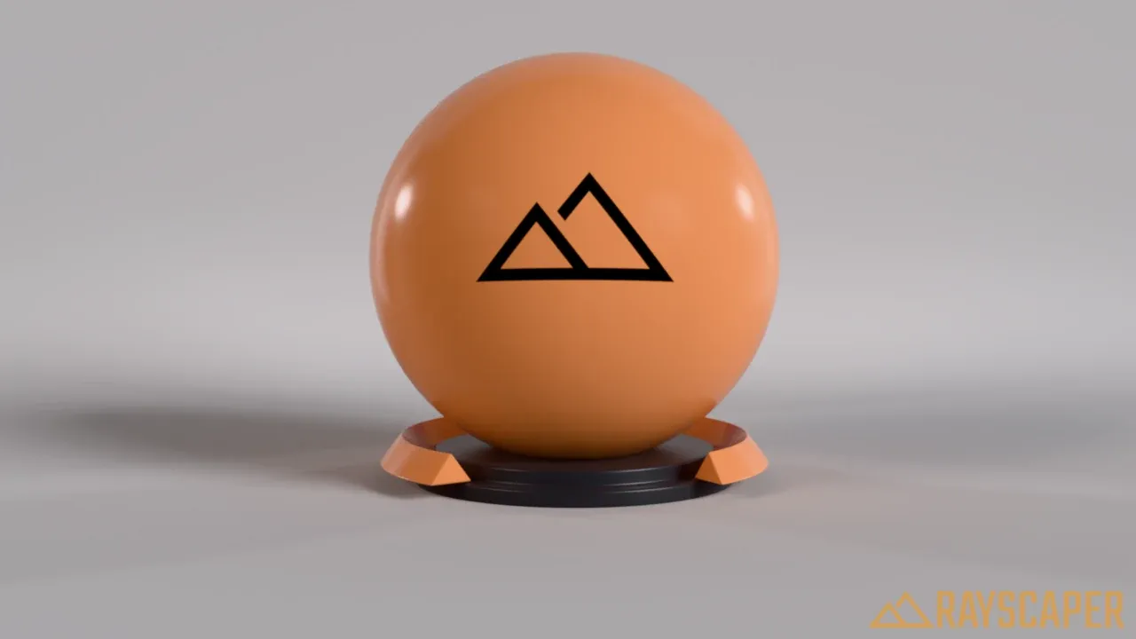
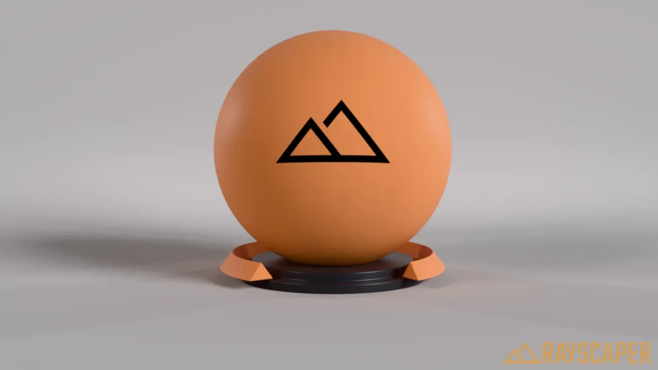
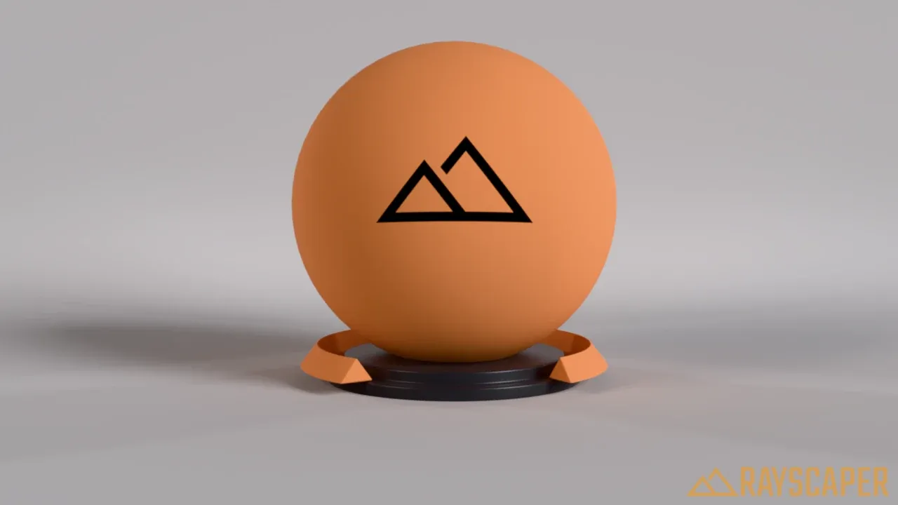
Index of Refraction (IOR): how strong the reflections are, especially when you look at the surface straight on. The default of 1.5 suits most materials, like plastic and glass. These examples use a dark, glossy material, where reflections show best:
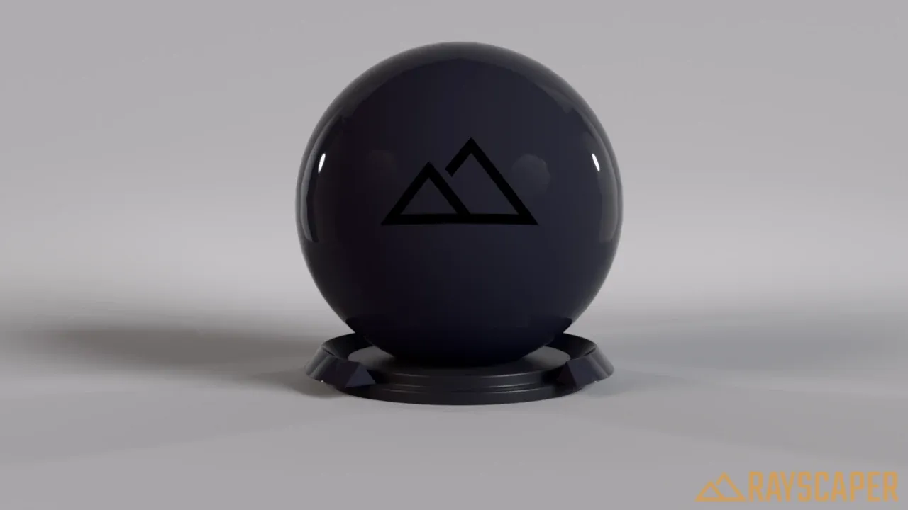
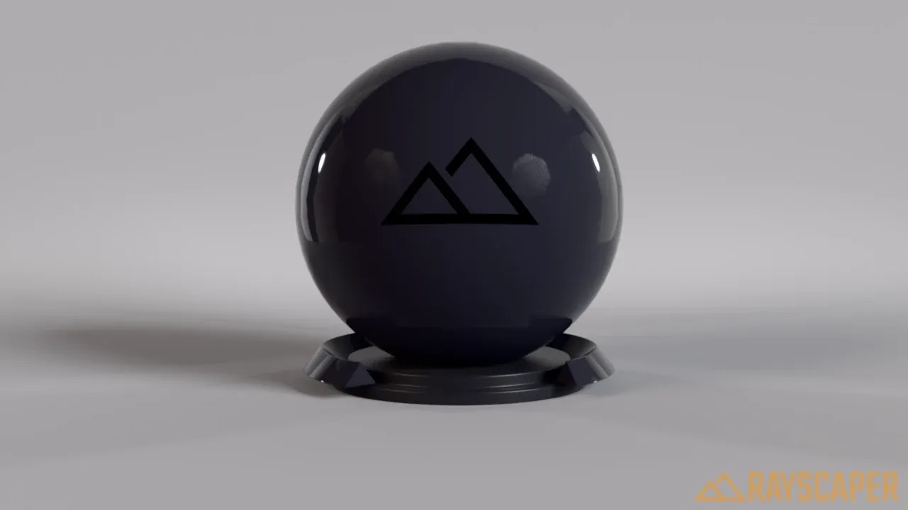
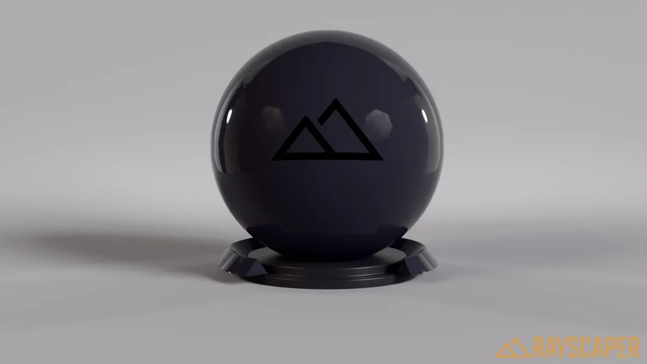
Advanced Settings
Section titled “Advanced Settings”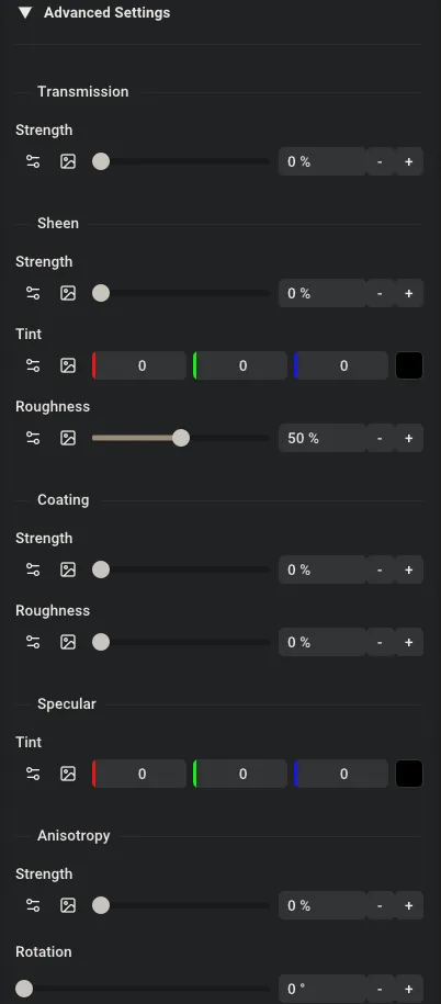
The PBR material advanced settings.
Expand Advanced Settings for the layers below.
Transmission
Section titled “Transmission”How much light passes through the material. 0% is opaque, 100% transmits like glass. The Index of Refraction (IOR) in the main settings controls how much the material bends the light.
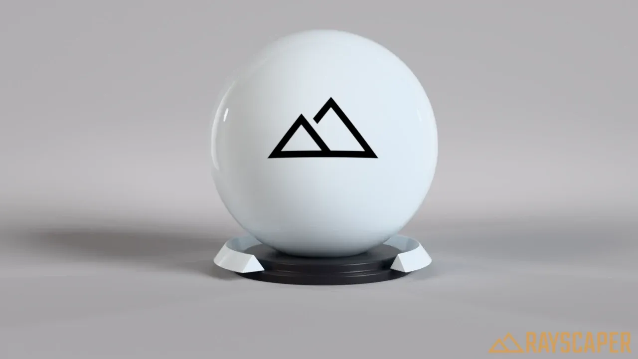
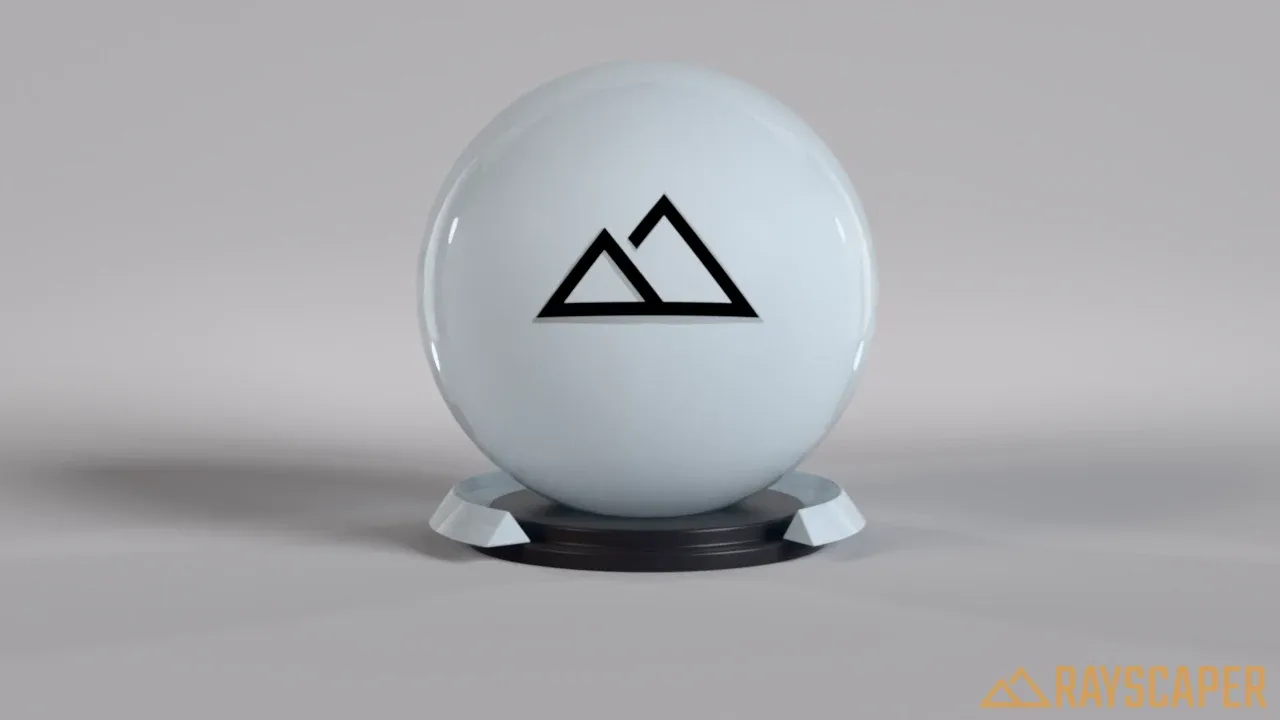
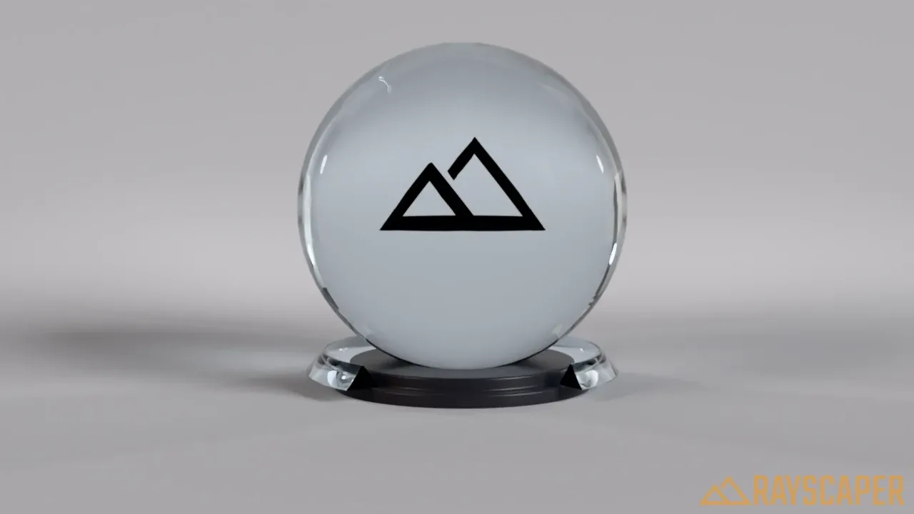
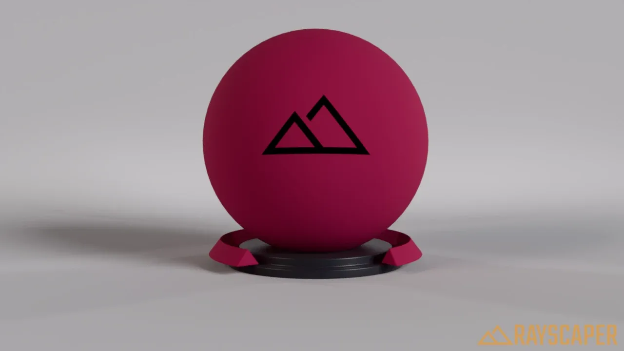
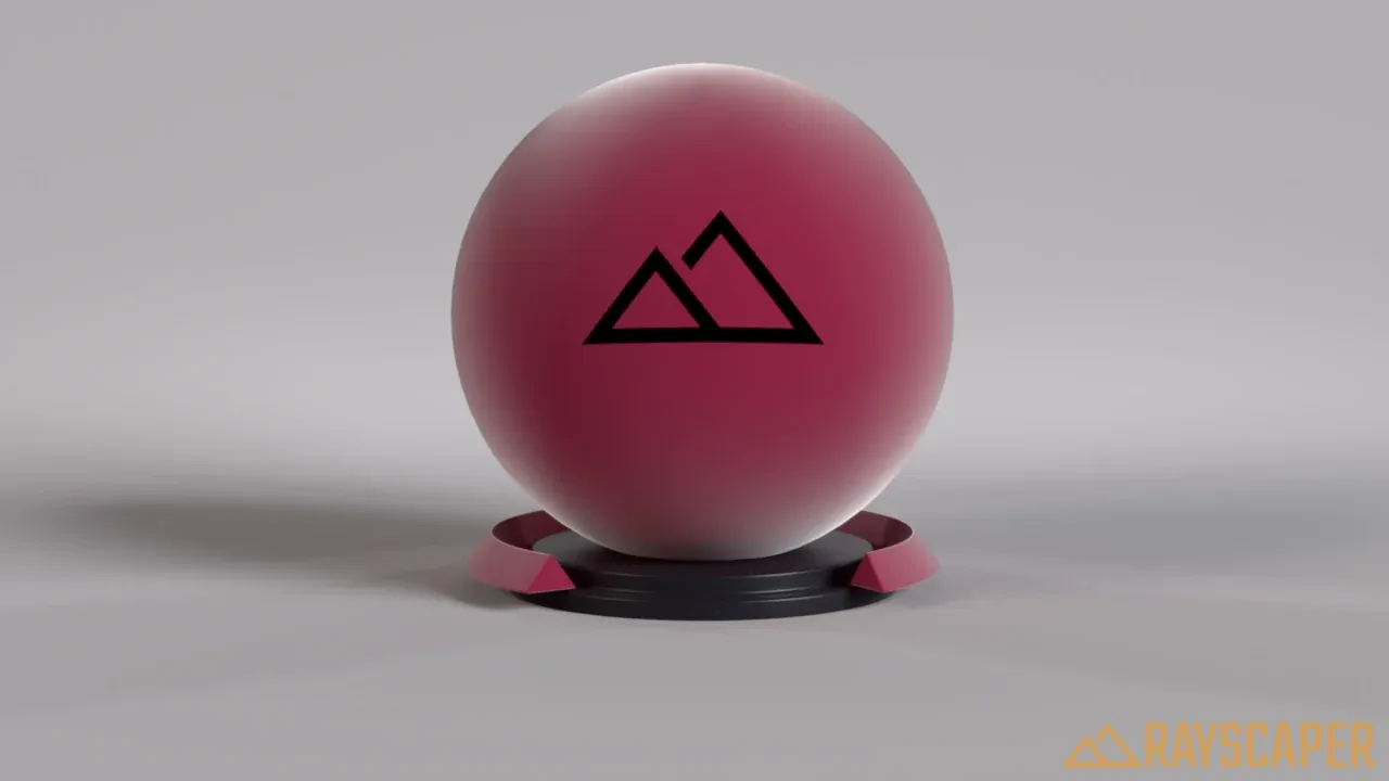
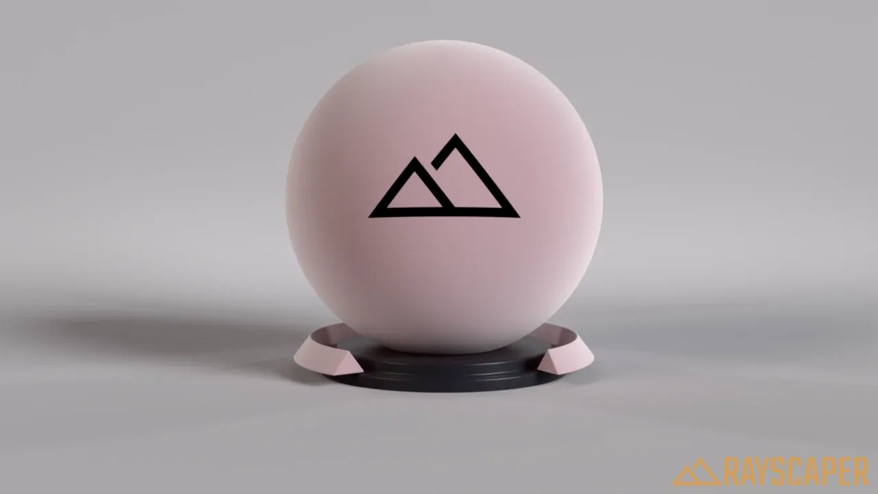
A soft glow at the edges, as on velvet and other fabrics with fine fibers.
Strength: 0% turns sheen off, 100% gives a strong velvet-like edge glow.
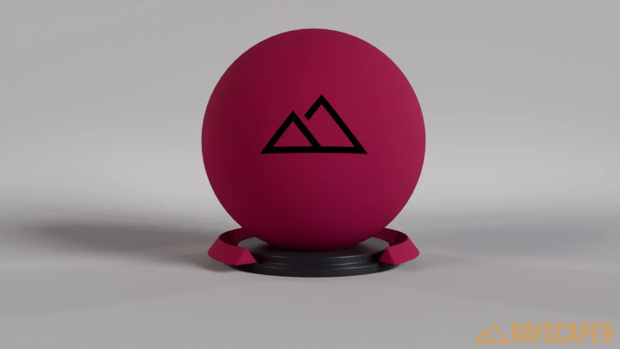
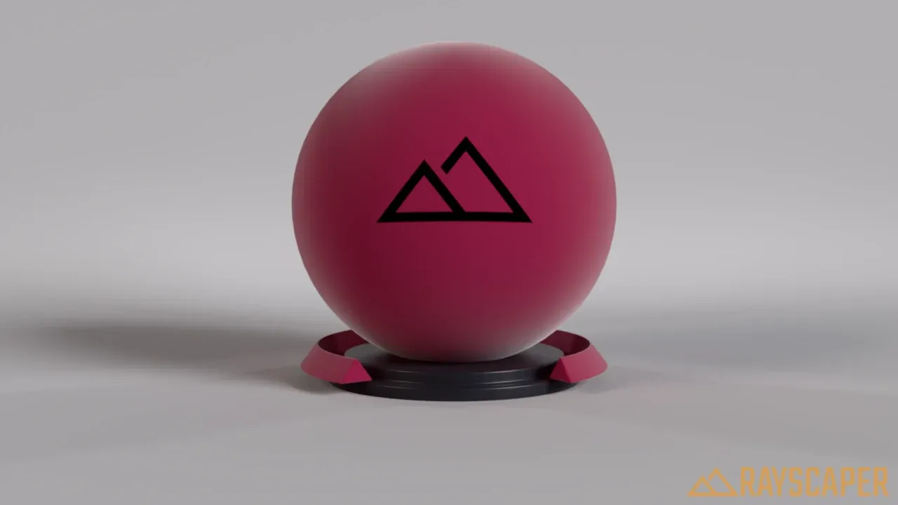
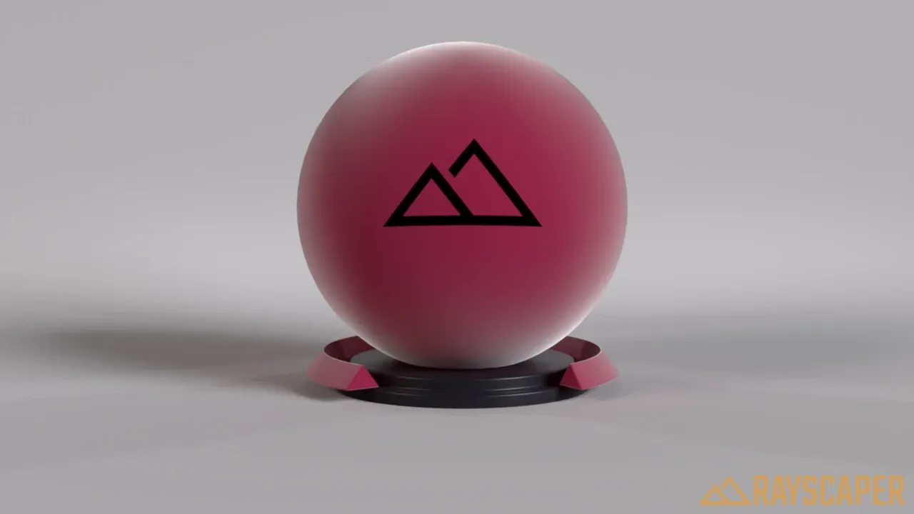
Tint: the color of the sheen. White gives a neutral sheen.
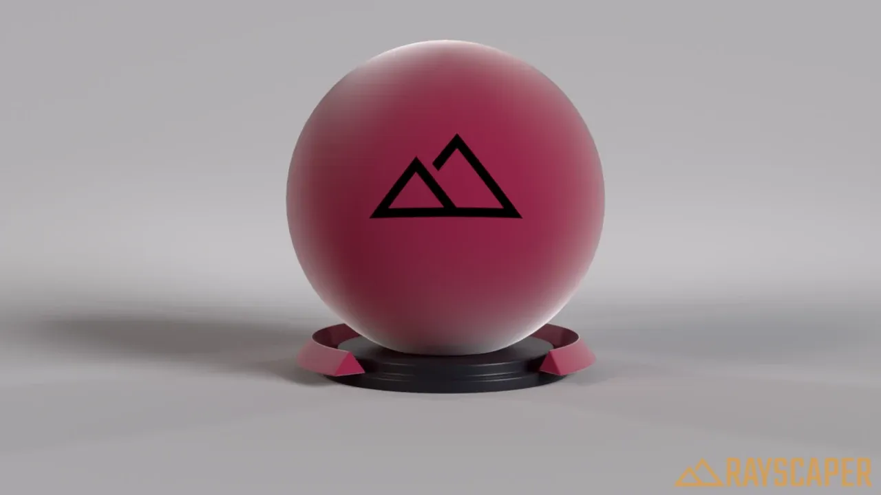
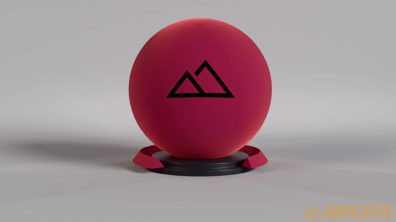
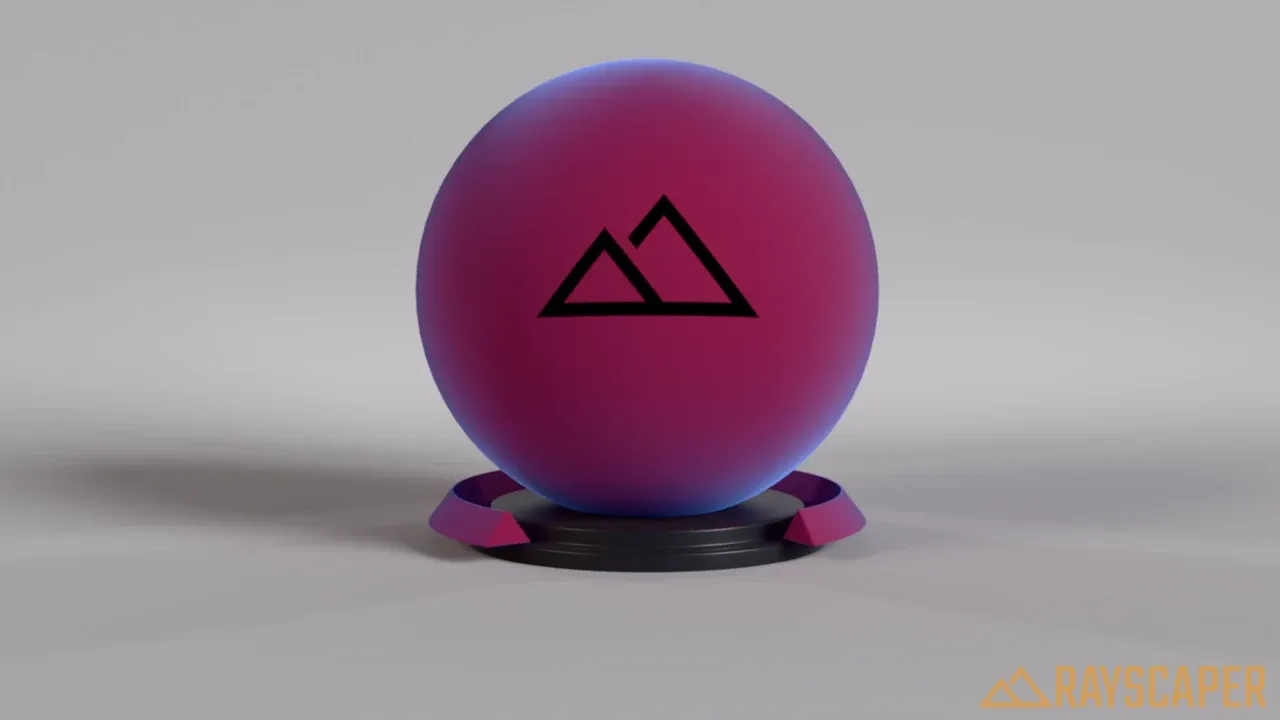
Roughness: low values keep the sheen in a narrow band at the edges, high values spread it over the surface.
Coating
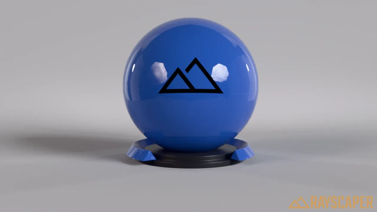
Section titled “Coating”A clear layer of varnish or lacquer on top of the material. It works best on top of a rough base, like car paint or varnished wood.
Strength: 0% turns the coating off, 100% applies it fully.
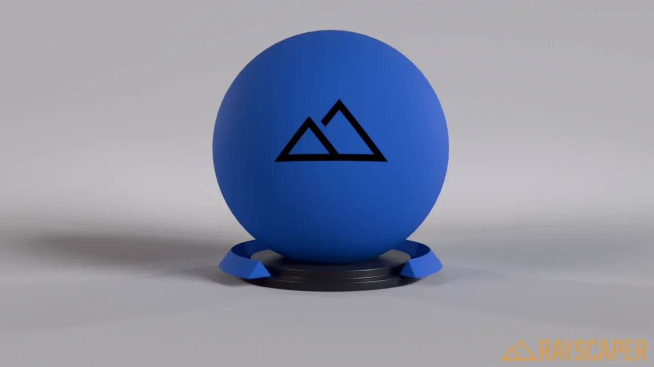
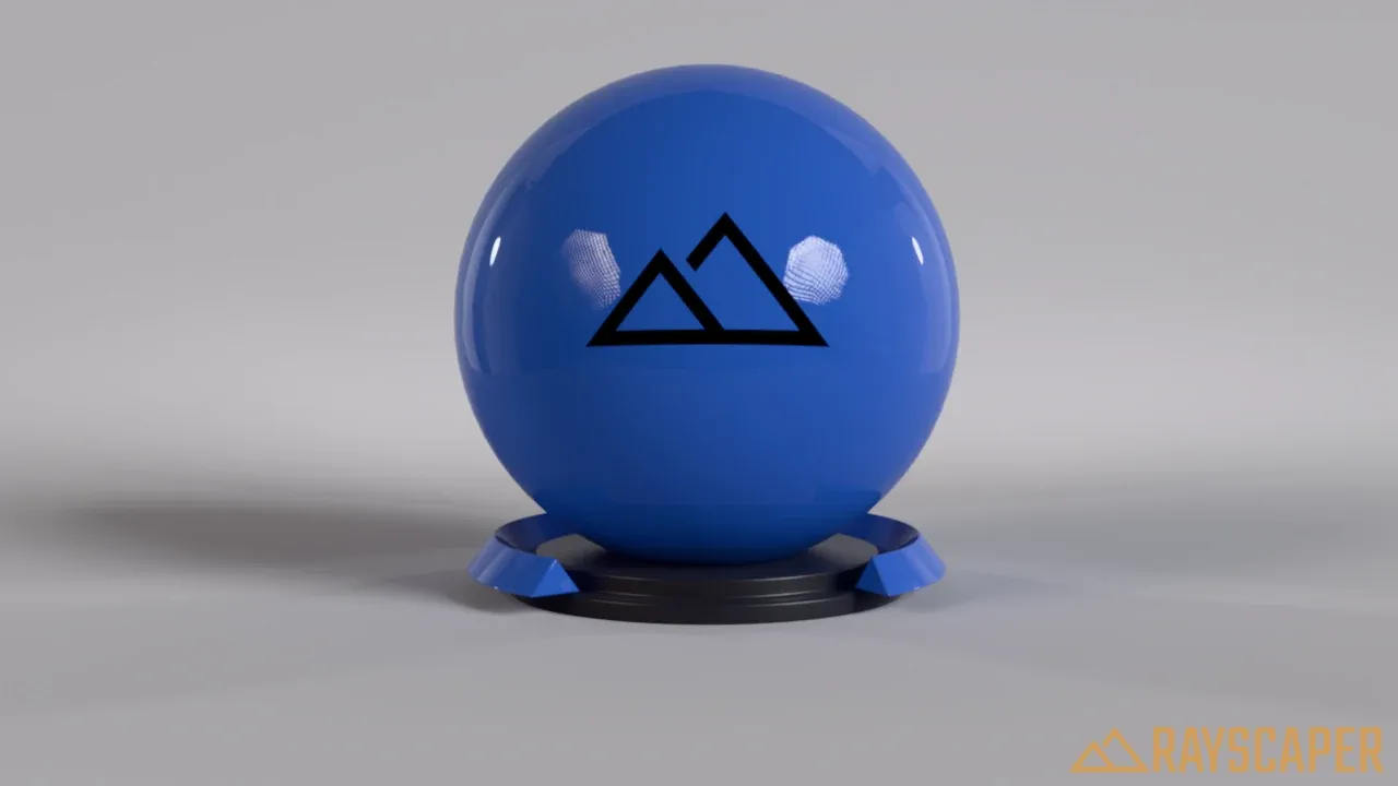
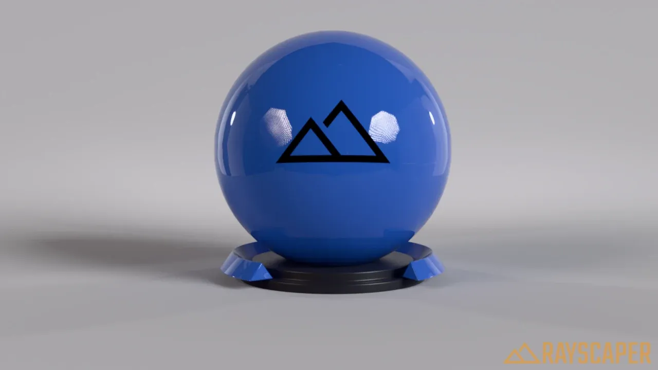
Roughness: how smooth the coating is. 0% gives sharp, glossy reflections, 100% soft, matte ones.
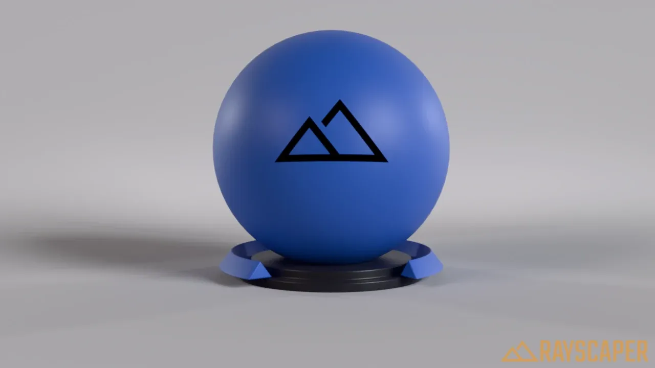
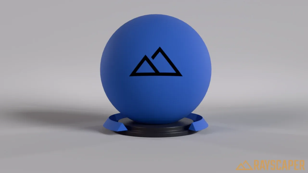
Specular
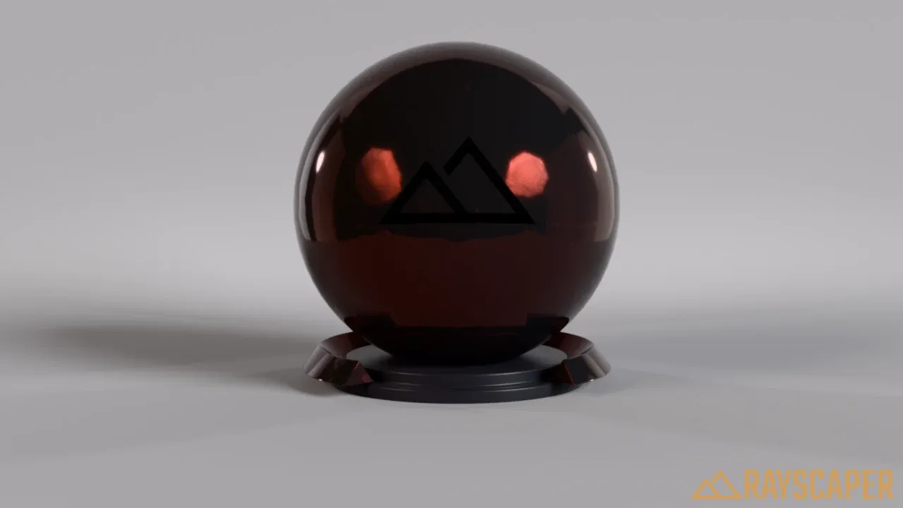
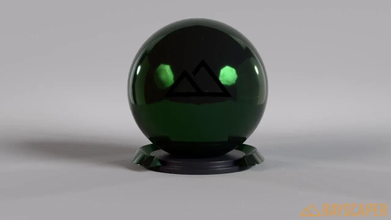
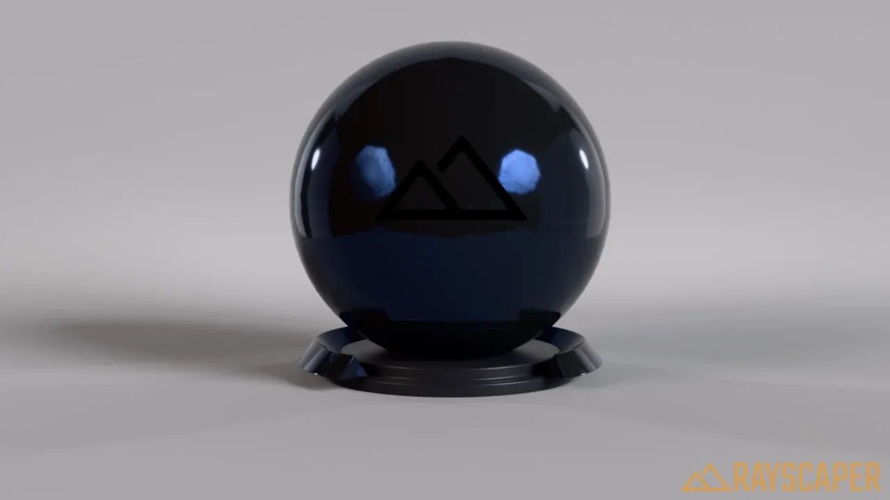
Section titled “Specular”Tint: the color of the reflections of a non-metal. White is physically accurate for almost every material, a color gives tinted reflections. These examples use a black base, so only the reflections show:
Anisotropy
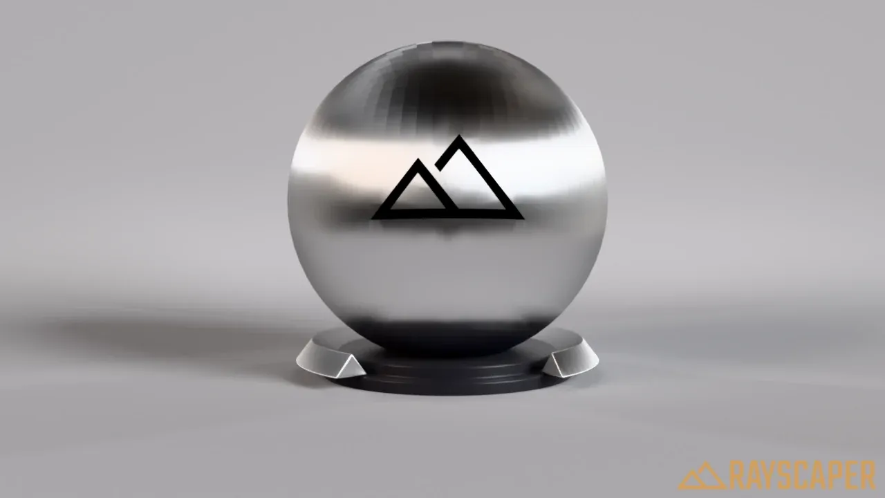
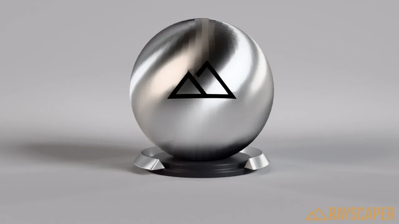
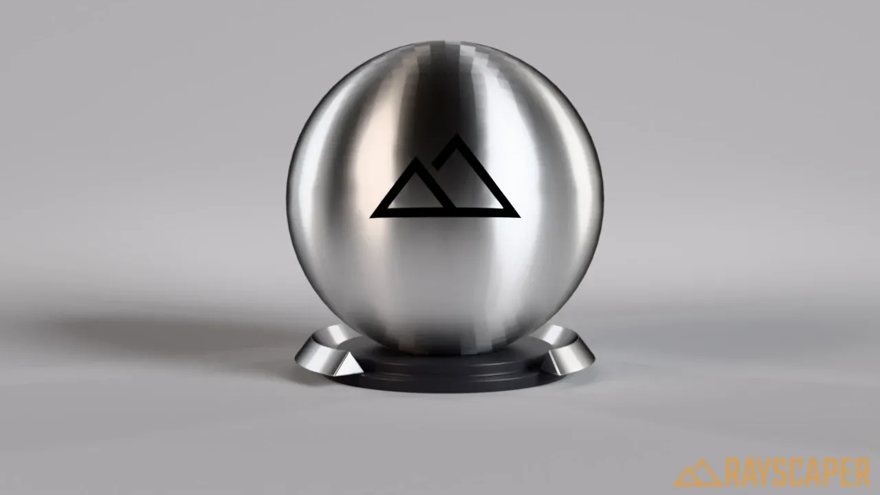
Section titled “Anisotropy”Stretches the highlights in one direction. Use it for brushed metal, hair, satin and other materials with a direction in their surface.
Strength: higher values stretch the highlights further.
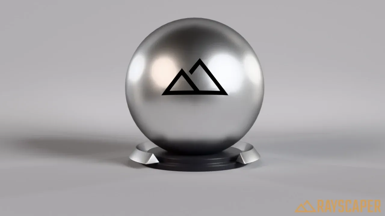
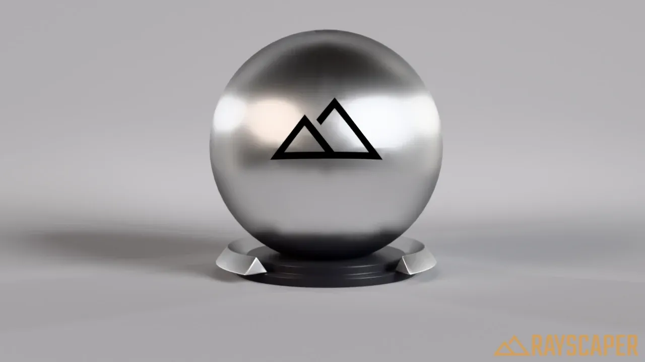
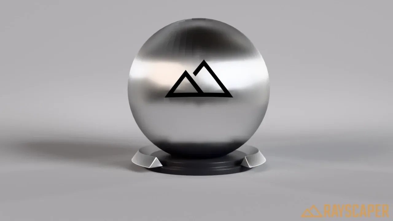
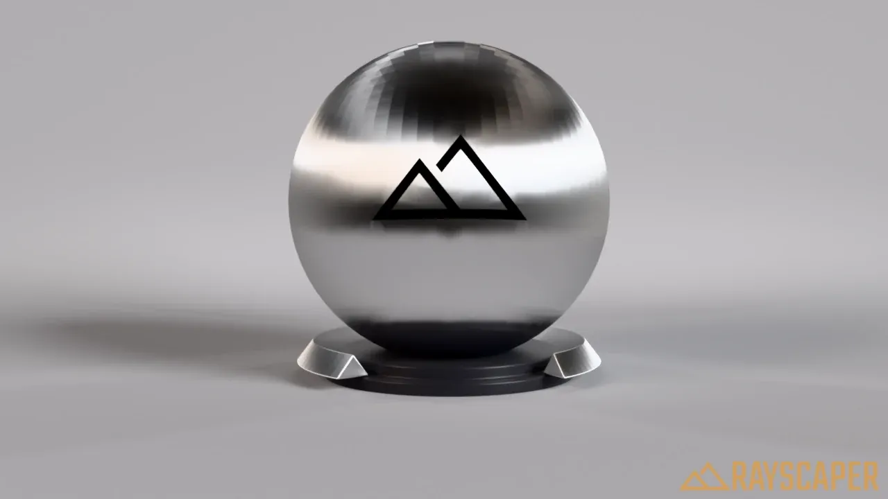
Rotation: turns the direction of the stretching, to align it with the grain of the material, for example the brushing direction of a steel panel.
Plastic Material
Section titled “Plastic Material”A matte base with a glossy layer that has its own color. Unlike the Coated material, the reflection fades in at grazing angles like real plastic, controlled by the IOR. Use it for plastics, glossy paint and enamel.
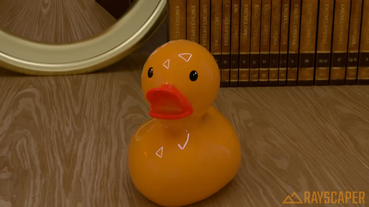
A rubber duck: a yellow base with white glossy reflections.
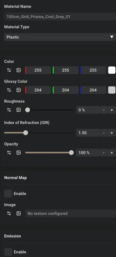
The Plastic material settings.
| Setting | Description |
|---|---|
| Color | The base color, visible wherever there’s no reflection. |
| Glossy Color | The color of the reflections and highlights. White for most plastics. |
| Roughness | How sharp the reflections are: 0% is polished, higher values satin. |
| Index of Refraction (IOR) | How strong the reflections are at different angles. About 1.5 for most plastics. |
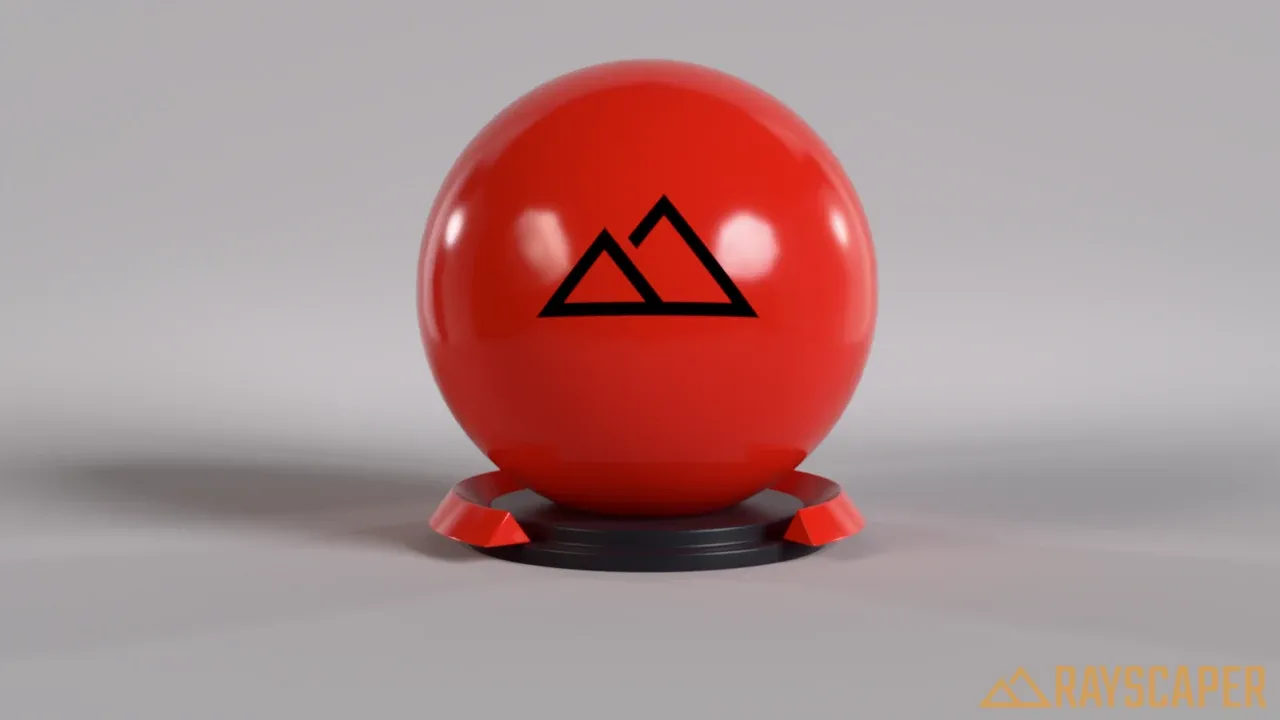
A plastic material with a red base and white reflections.
Water Material
Section titled “Water Material”A material made for swimming pools, ponds, lakes, fountains, and other bodies of water in architectural scenes. It combines a reflective, refracting water surface with procedural waves and depth-dependent color, so you get convincing water from a single flat face—no textures, normal maps, or water volumes required.
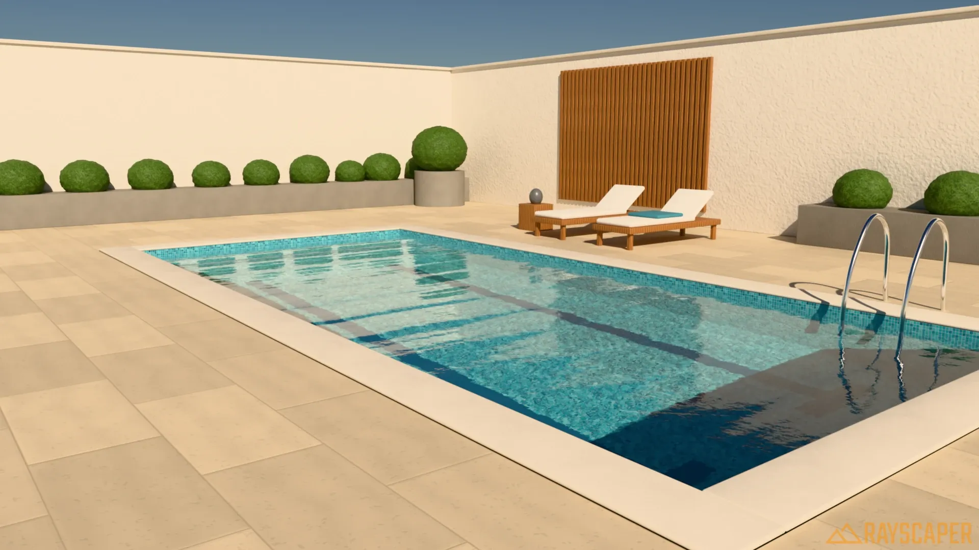
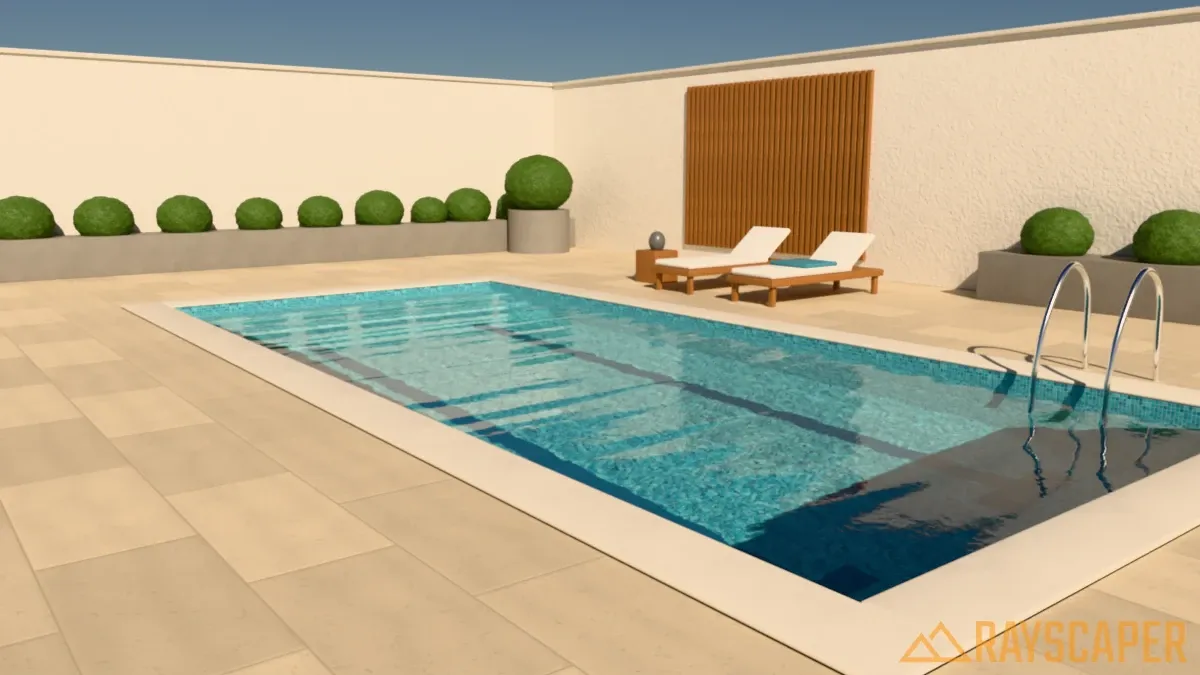
A courtyard pool rendered with the Water material. The deep end takes on more color than the steps, the mosaic floor warps with the waves, and the far side of the pool reflects the wall and sky.
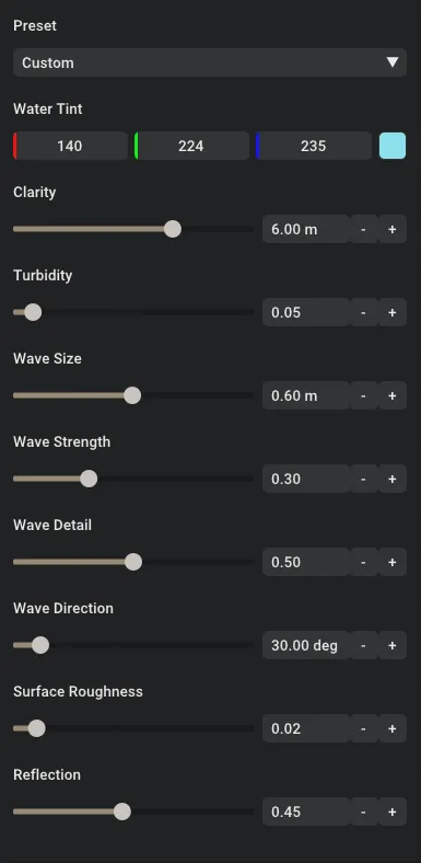
Water material settings showing Preset, Water Tint, Clarity, Turbidity, Wave Size, Wave Strength, Wave Detail, Wave Direction, Surface Roughness, and Reflection. These are the settings used for the pool above.
Preset: Applies a complete set of water values in one click. Start from the preset closest to your scene and fine-tune from there. As soon as you change any other setting, the preset switches to Custom. A new Water material also starts at Custom, with generic values, so pick a preset first: Pool is a good start.
| Preset | Use it for |
|---|---|
| Pool | Clear, calm swimming pool water with small ripples. |
| Pond | Murky green garden ponds. |
| Lake | Natural open water with a slow, large swell. |
| Windy | Choppy water with strong waves and lots of small ripples. |
| Tropical | Very clear turquoise water, like a resort pool or a shallow lagoon. |
| Reflecting Pool | Dark, nearly still water that mirrors its surroundings. |
| Spa | Agitated hot tub or whirlpool water with small, busy waves. |
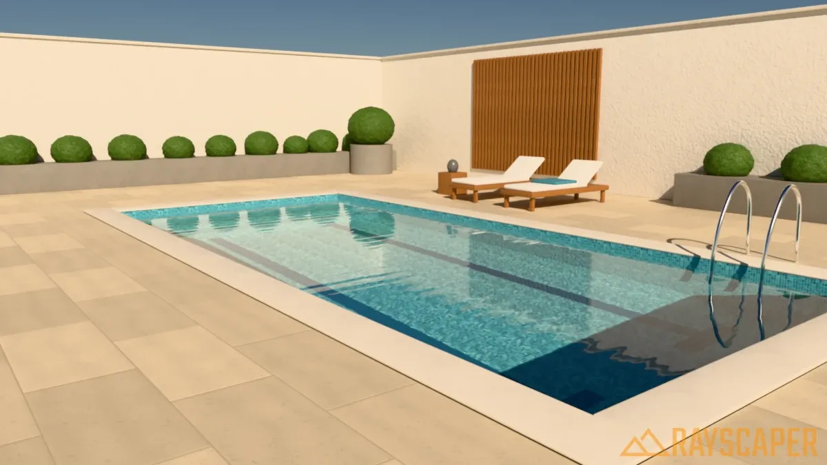
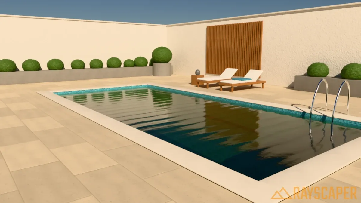
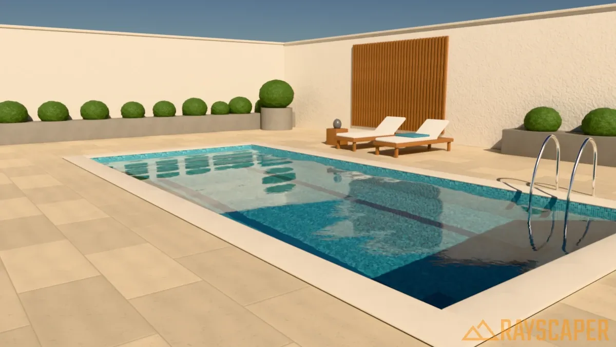
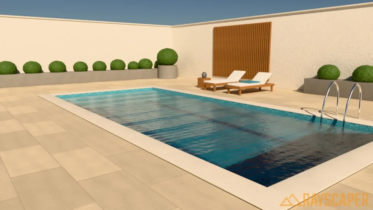
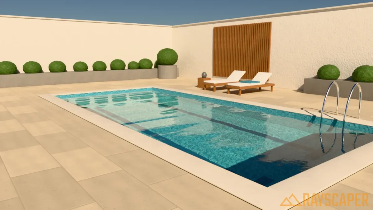
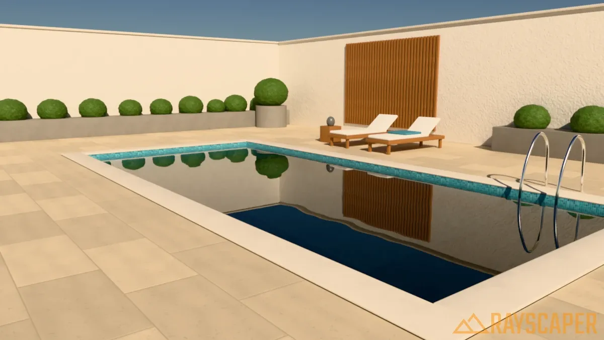
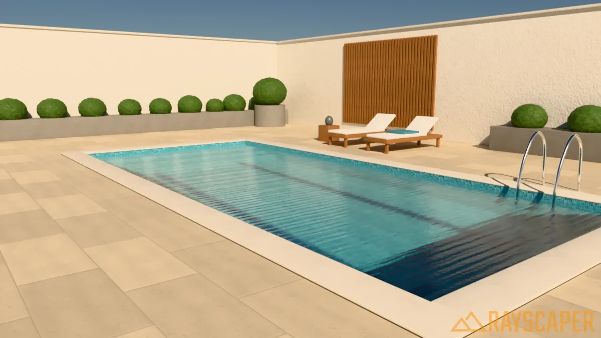
The examples below start from the same pool and change one setting at a time.
Water Tint: The color the water takes on as light travels through it. Shallow water shows only a hint of the tint, while deep water shows its full color. The tint doesn’t color the reflections on the surface, only what you see through the water. Use a light aqua for pools, green or brown for ponds, and a deeper blue for lakes and the sea.
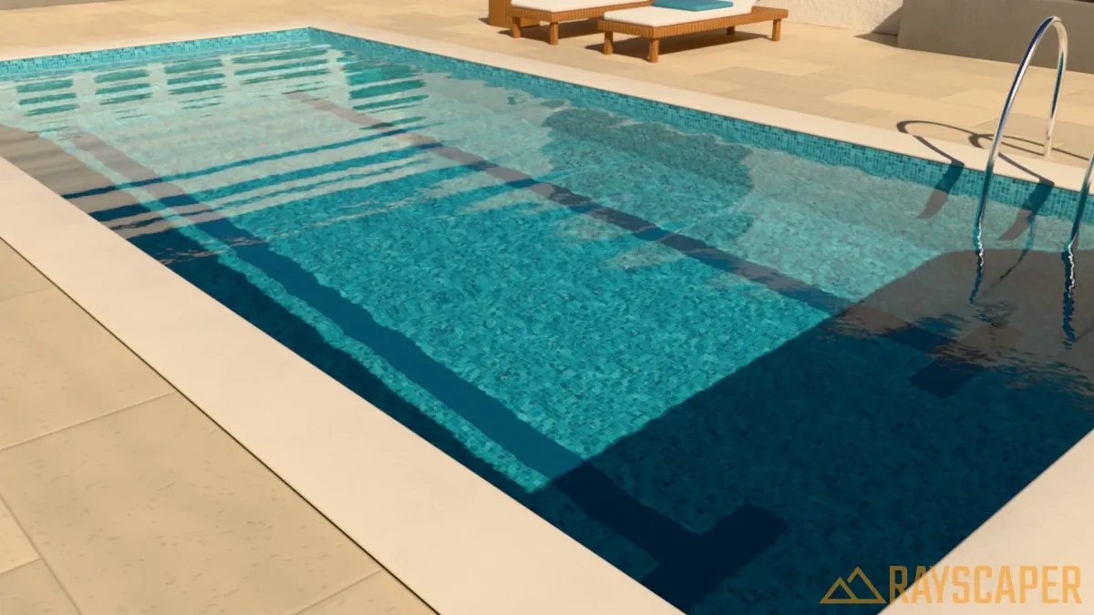
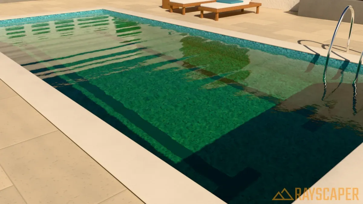
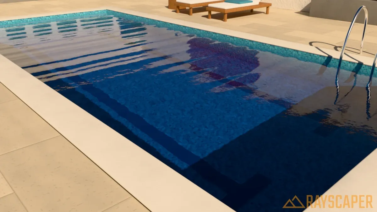
Clarity: How far light travels through the water before it reaches the full Water Tint, from 0.1 m to 50 m. Low values give murky water where the bottom quickly fades into the tint color. High values give crystal-clear water where you can see the floor of even a deep pool. Because Clarity is a distance, it works together with the depth of your pool: 2 m of clarity looks clear in a shallow pool but hazy in a deep one. The examples below use a stronger blue tint to make the difference easy to see.
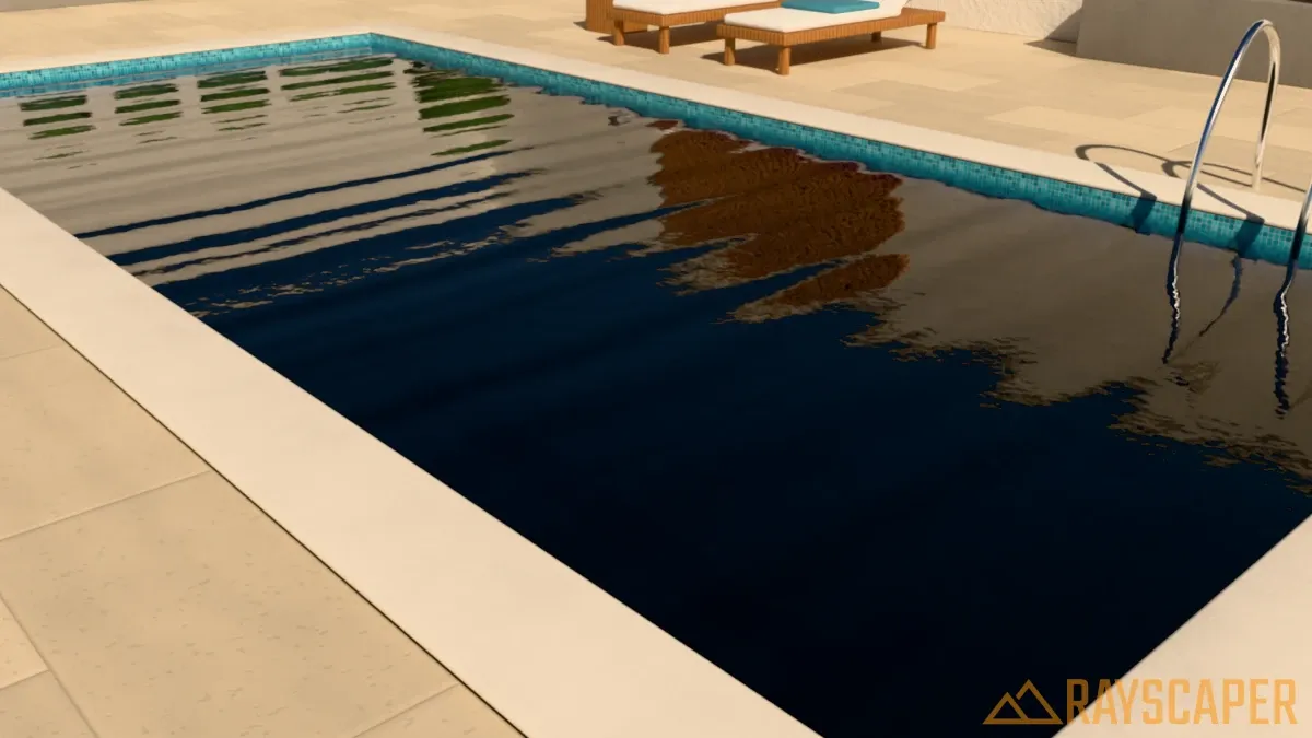
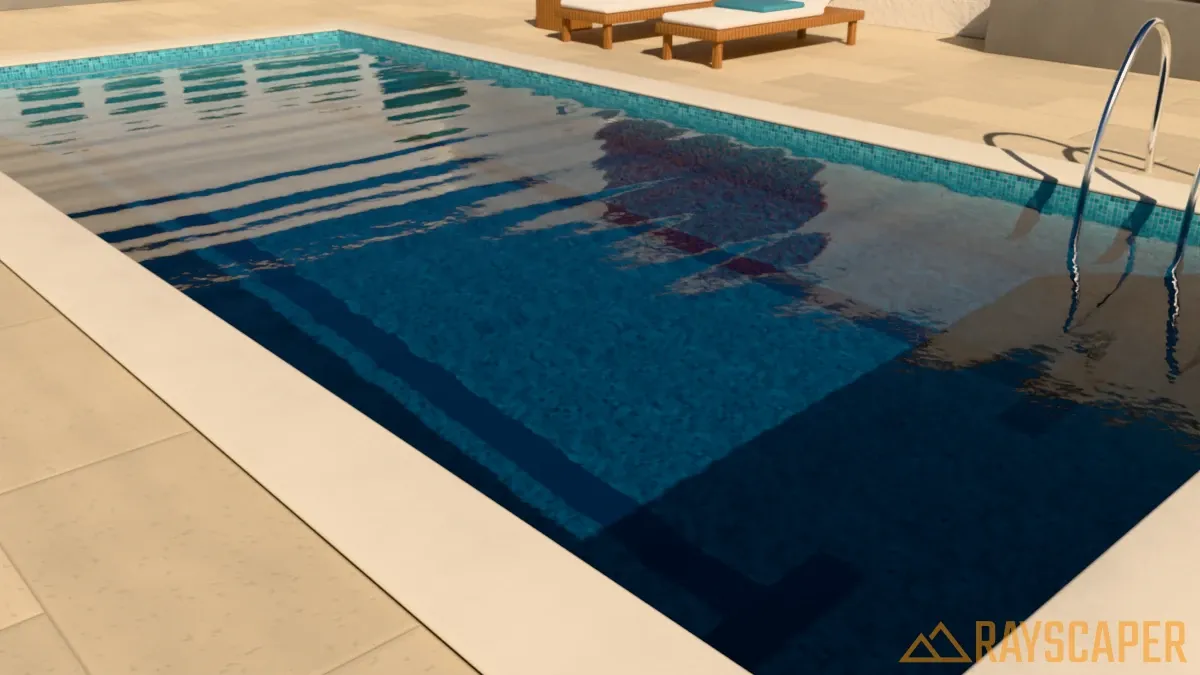
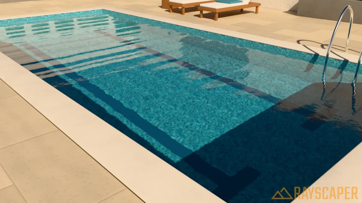
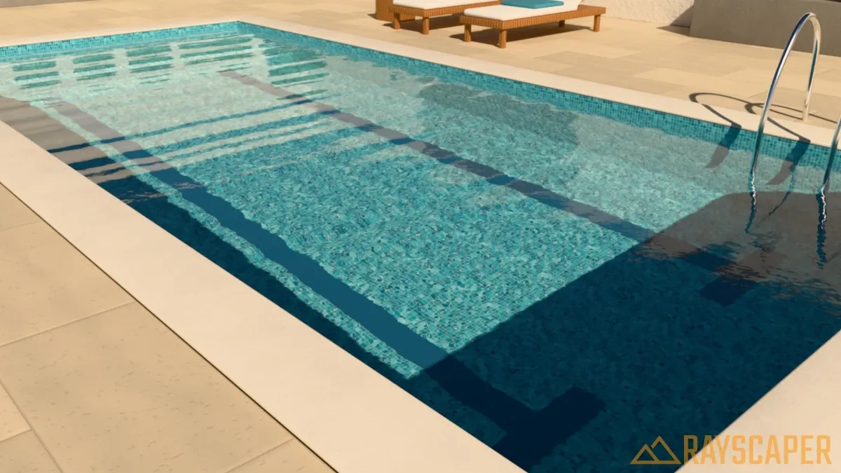
Turbidity: How much suspended matter, like algae or silt, is floating in the water, from 0 to 1. Turbid water scatters tinted light back toward the viewer and hides submerged objects, even in shallow areas. Keep this close to 0 for pools and increase it for ponds, rivers, and other natural water.
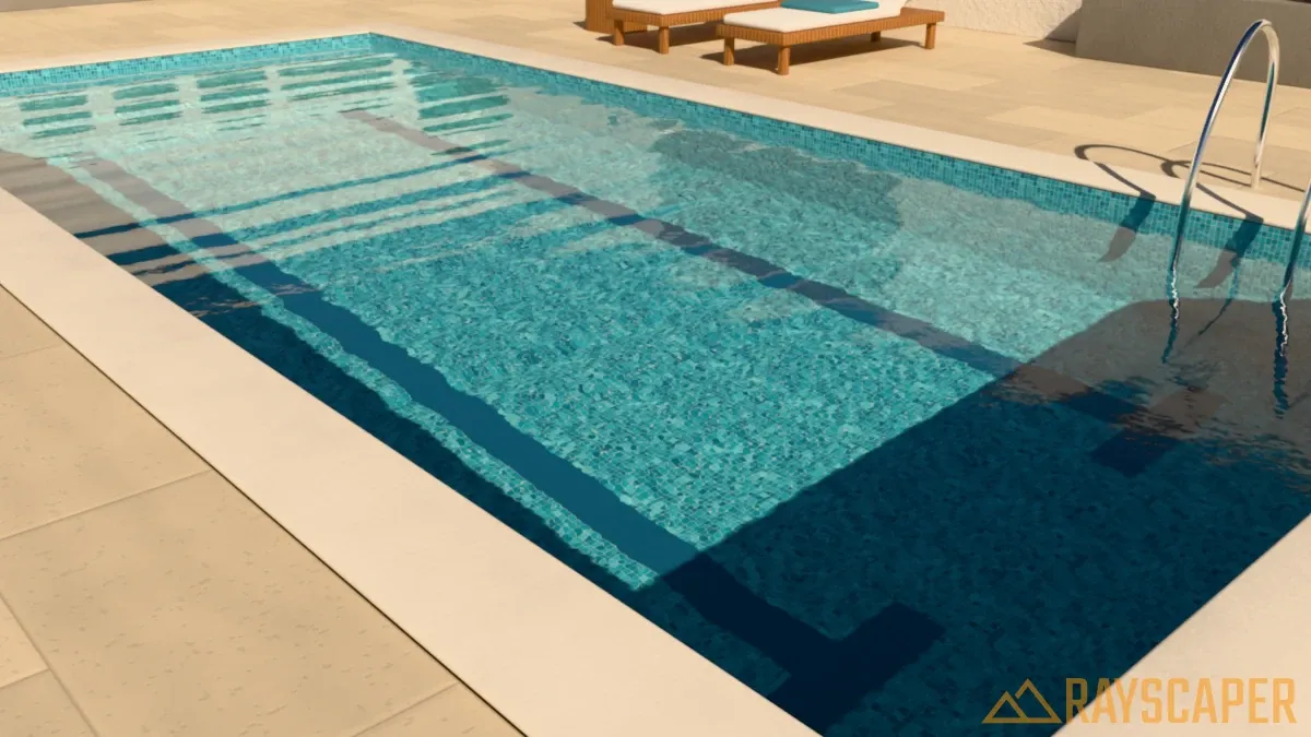
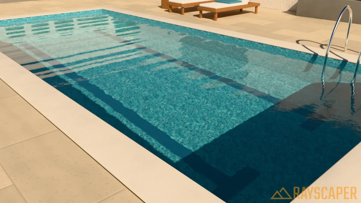
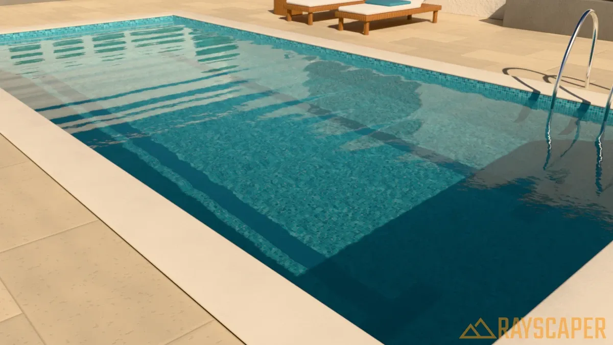
Wave Size: The distance between the crests of the main swell, from 0.05 m to 10 m. Small values give short ripples, like a pool with a light breeze or a fountain. Large values give the long, rolling swell of a lake. The examples below turn Wave Detail off so you only see the swell.
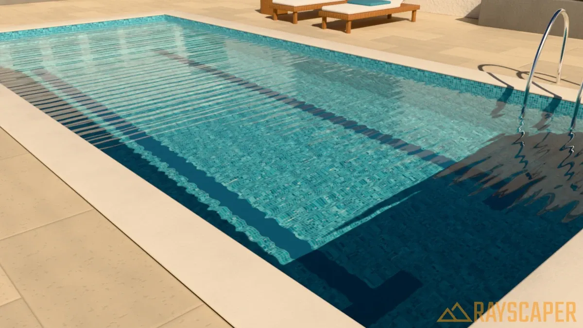
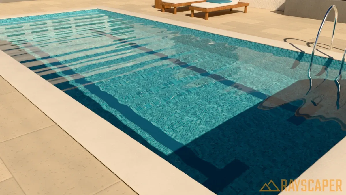
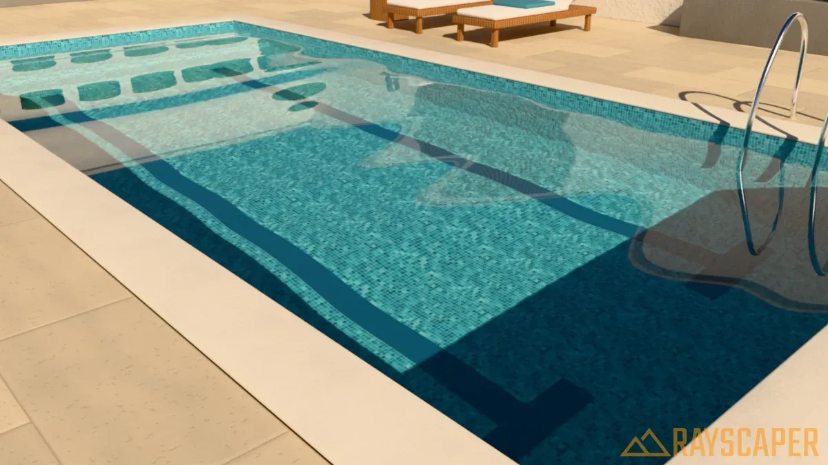
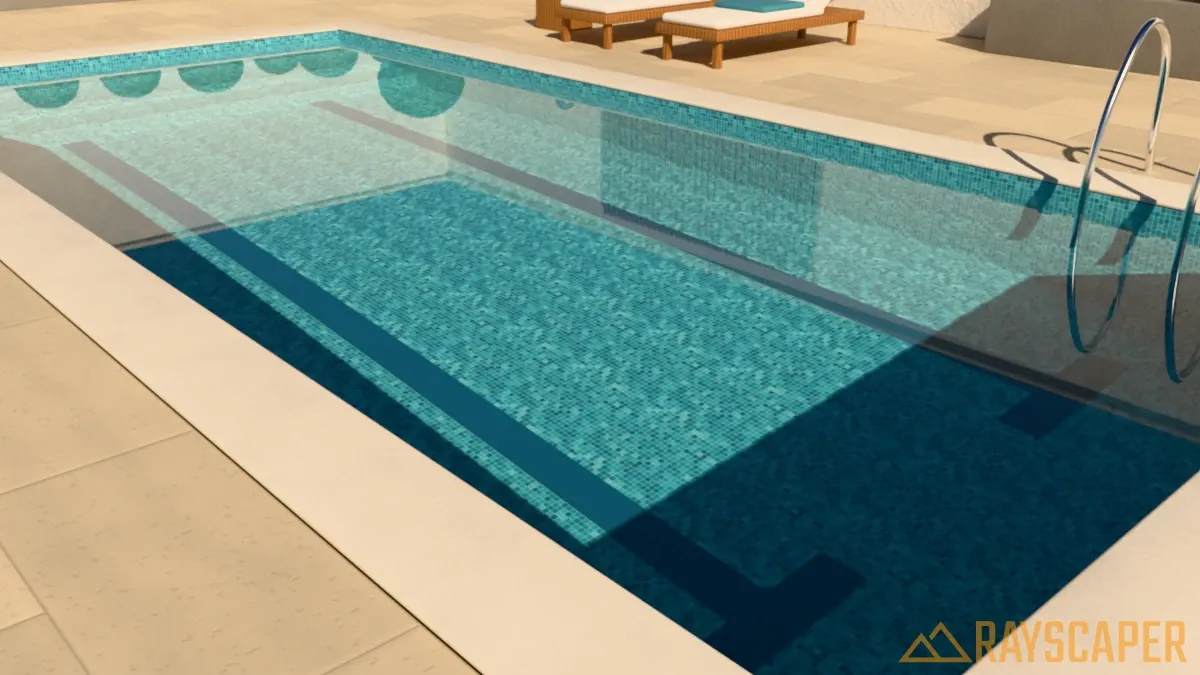
Wave Strength: How steep the waves are, from 0 to 1. At 0 the water is perfectly calm and behaves like a flat pane of glass. Higher values distort the view of the pool floor more and break up the reflections on the surface.
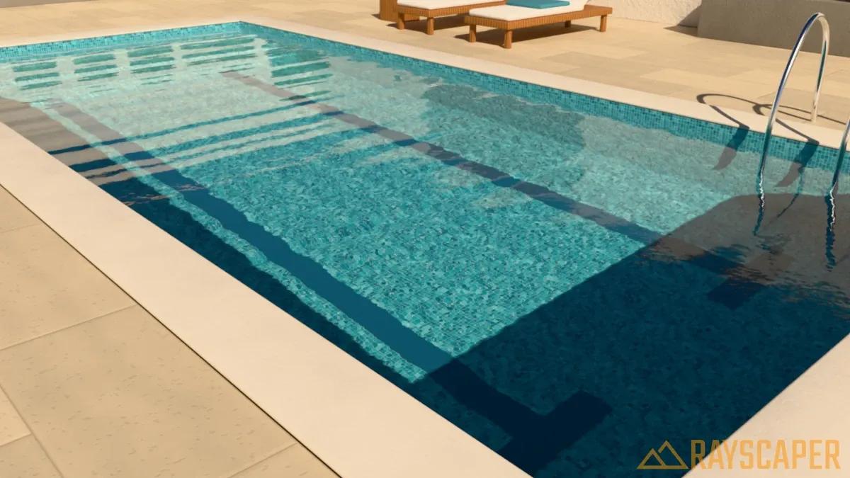
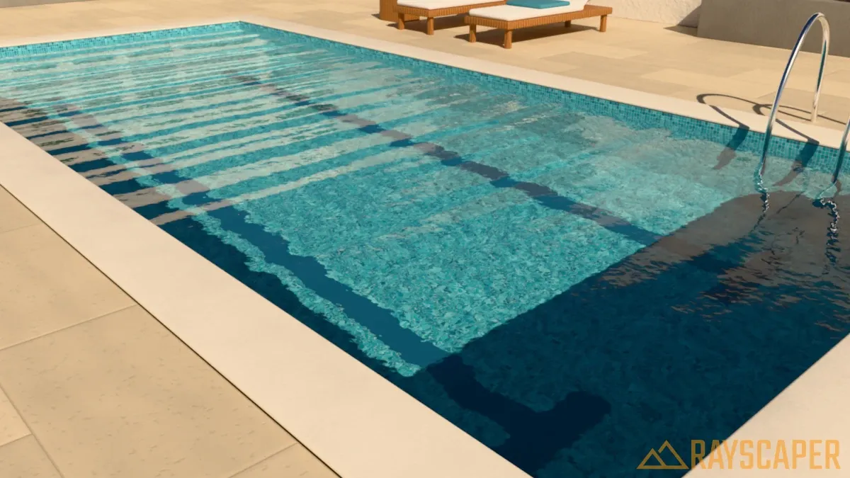
Wave Detail: Adds small ripples on top of the main swell, from 0 to 1. Low values give a smooth, rolling surface. High values give agitated, wind-blown water.
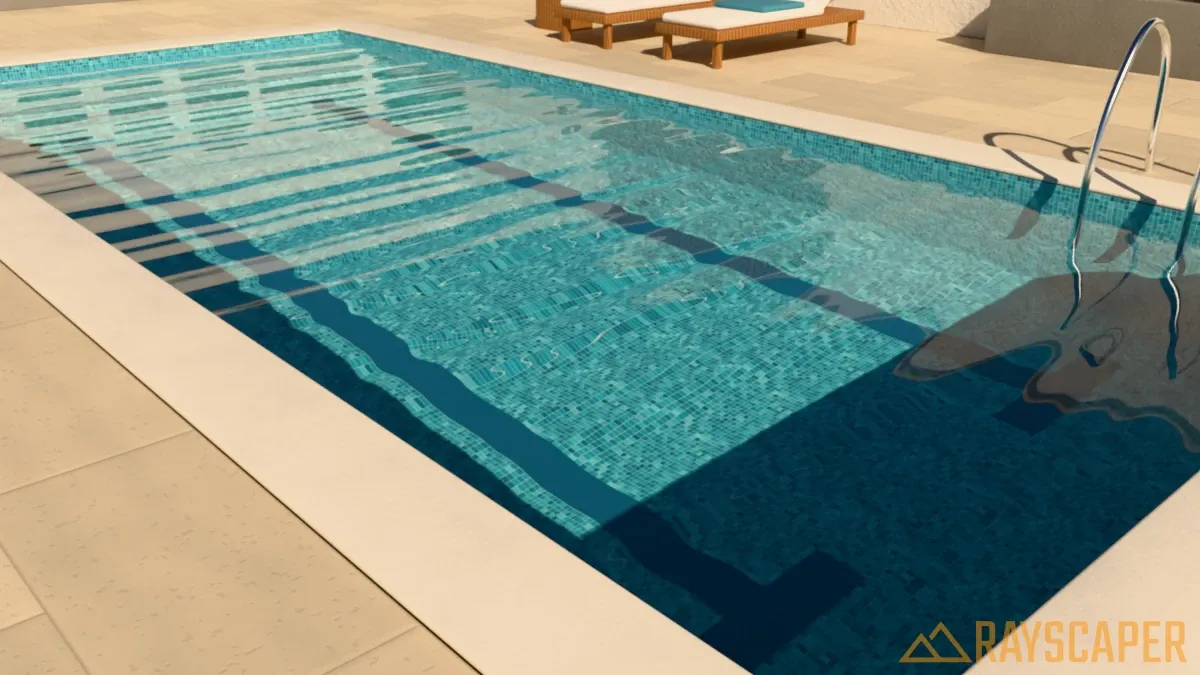
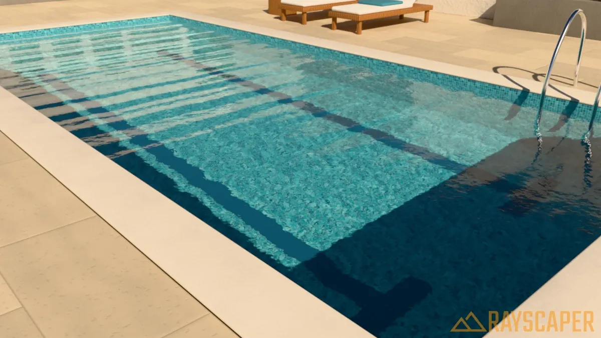
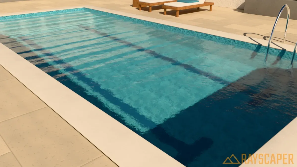
Wave Direction: The direction in which the waves travel, from 0° to 360°. At 0° the waves travel along the red axis of the object that holds the water face, at 90° along its green axis. The downwind side of each wave is the steeper one. This setting has no visible effect when Wave Strength is 0.
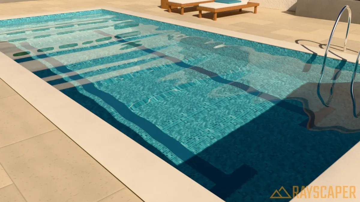
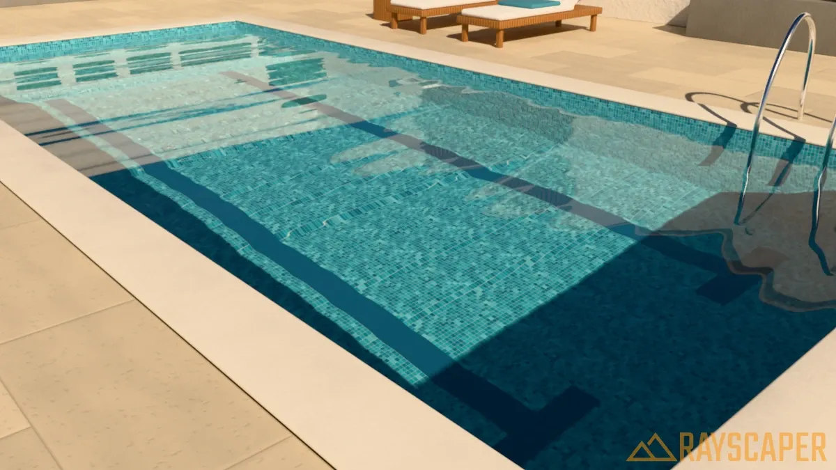
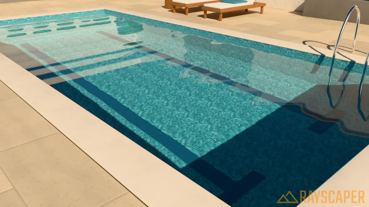
Surface Roughness: Blurs the reflections on the water surface, from 0 to 0.3. Use 0 for mirror-sharp reflections on still water, and a small value to soften reflections on a breezy day. The view through the water blurs only slightly, so the pool floor stays readable.
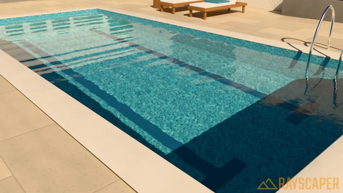
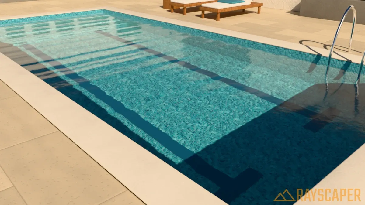
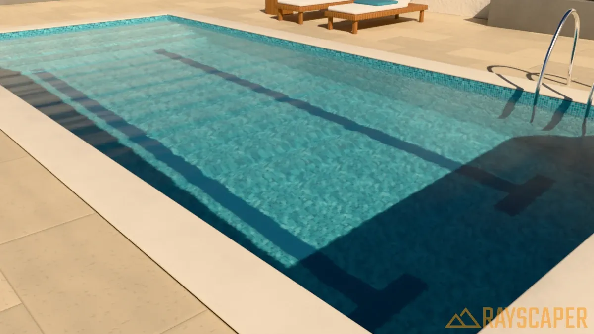
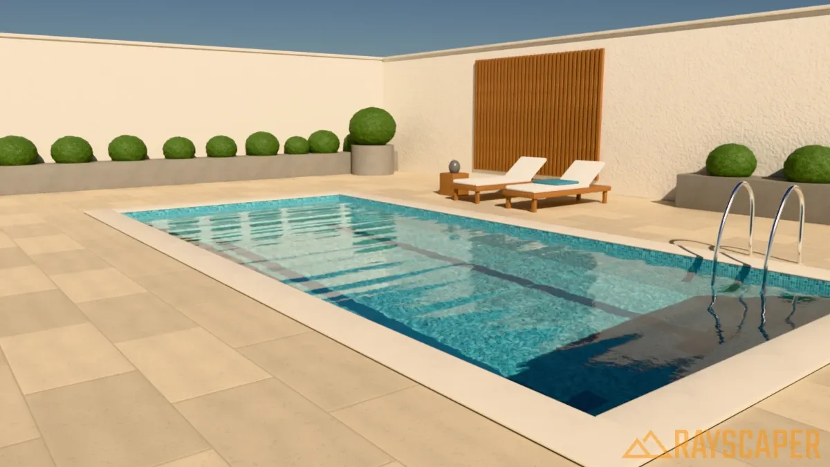
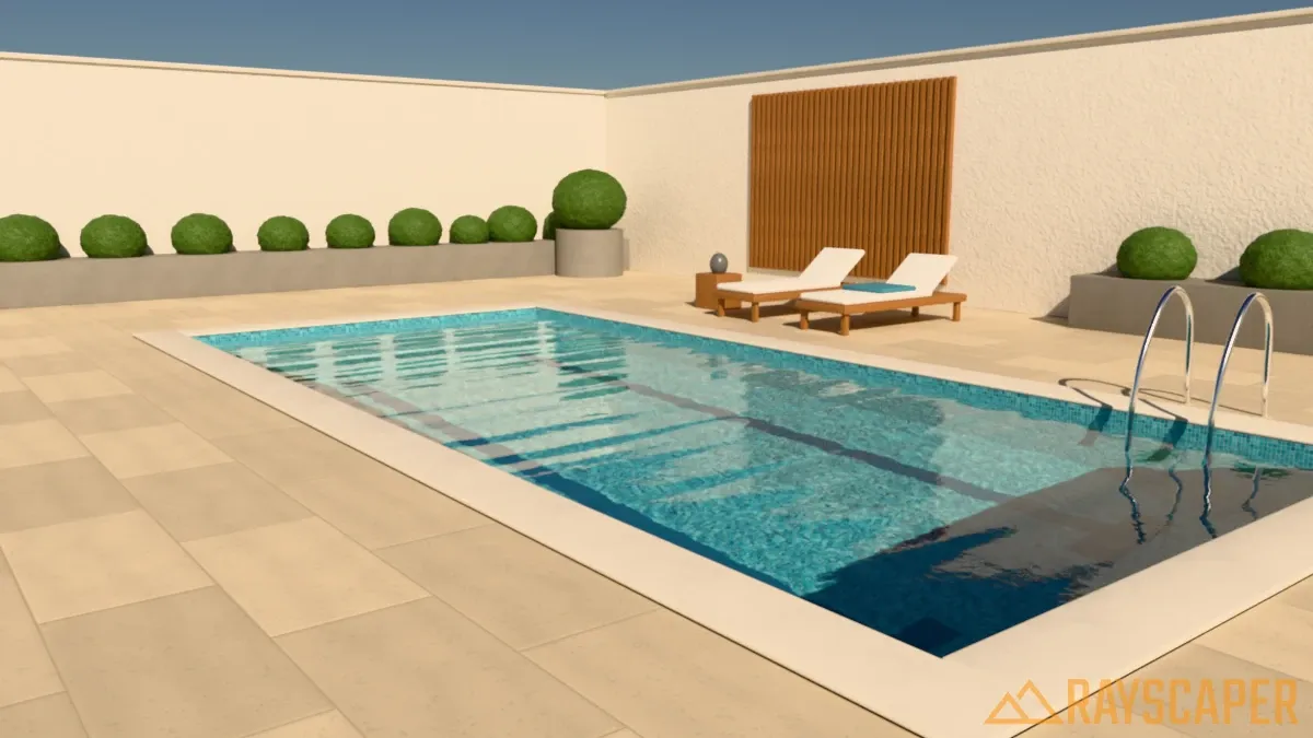
Reflection: The maximum strength of the reflections, from 0 to 1. Like real water, the surface reflects little when you look straight down and more at grazing angles; this setting limits how strong those grazing reflections can get. The default of 0.45 keeps the floor of the pool visible across the whole surface. Use 1 to let calm water turn into a mirror toward the horizon, as with a reflecting pool.
Credits
Section titled “Credits”The examples on this page use CC0 models, textures and HDRIs from Poly Haven.